Version 2.1
Version 2.1.0
Last updated: Dec 24th, 2024
FluxBuilder.com | MacOS | Windows | Web | Support | Video | Affiliate
The latest version of FluxBuilder (2.1.0) introduces powerful features that enhance user experience and enable impressive app designs.
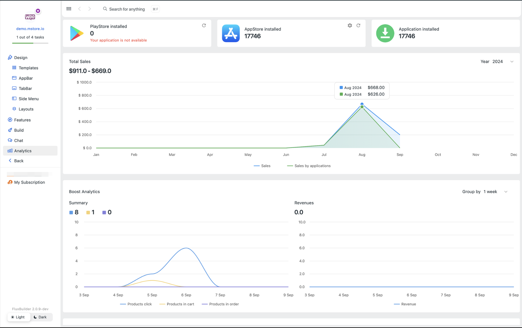
(1) Application Analytics ⚡️
You can now track and analyze your App Installs.
Other extended analytics are Total Sales generated from the app, Boost Analytics, Product Performance, Blog Performance, and Search Performance.
(2) Auto-Build PWA 🚀
FluxBuilder 2.1 now allows you to automatically build Progressive Web Apps (PWA).
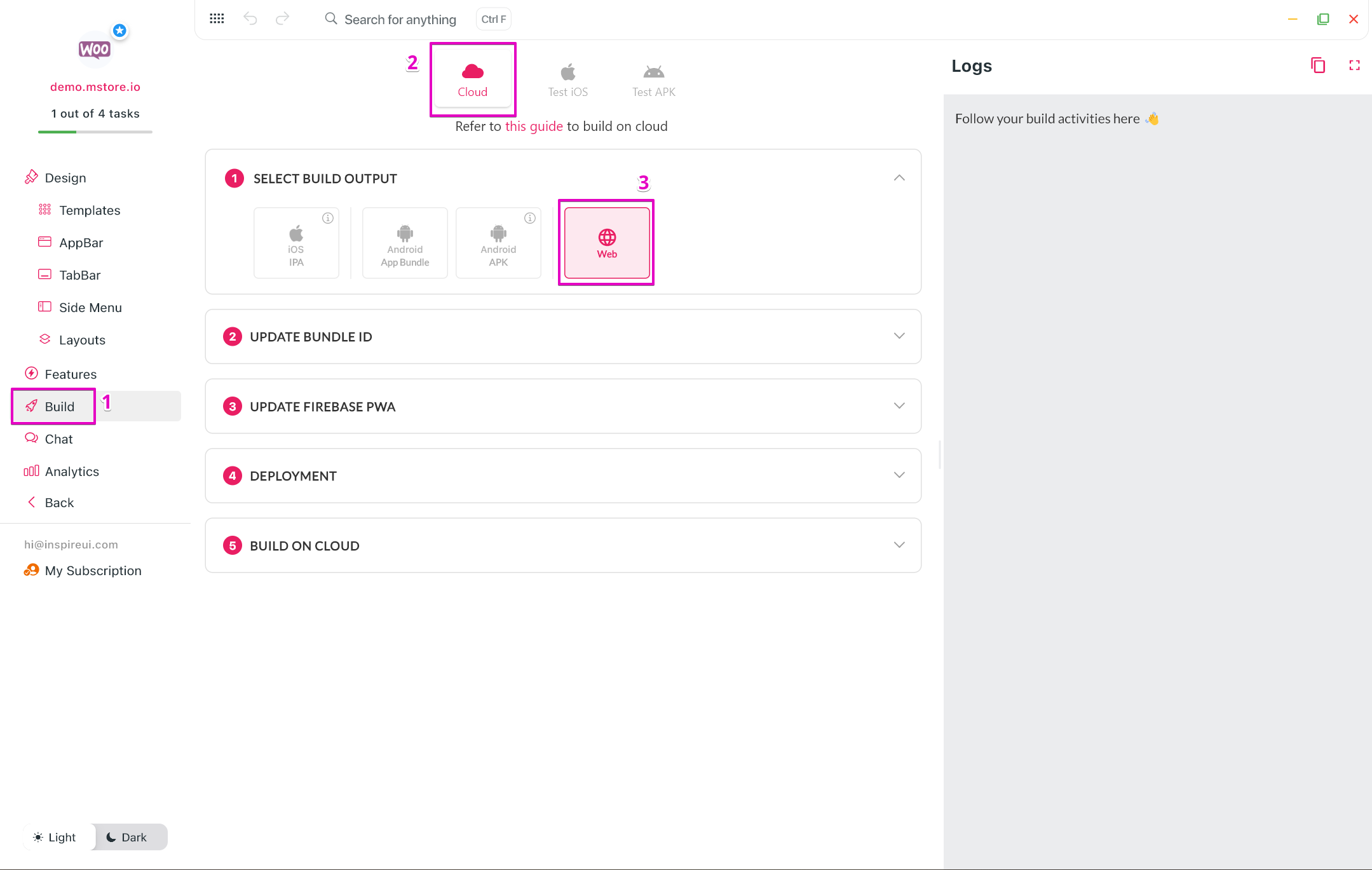
Note: Some layouts will be adjusted to fit the requirements of the web platform.
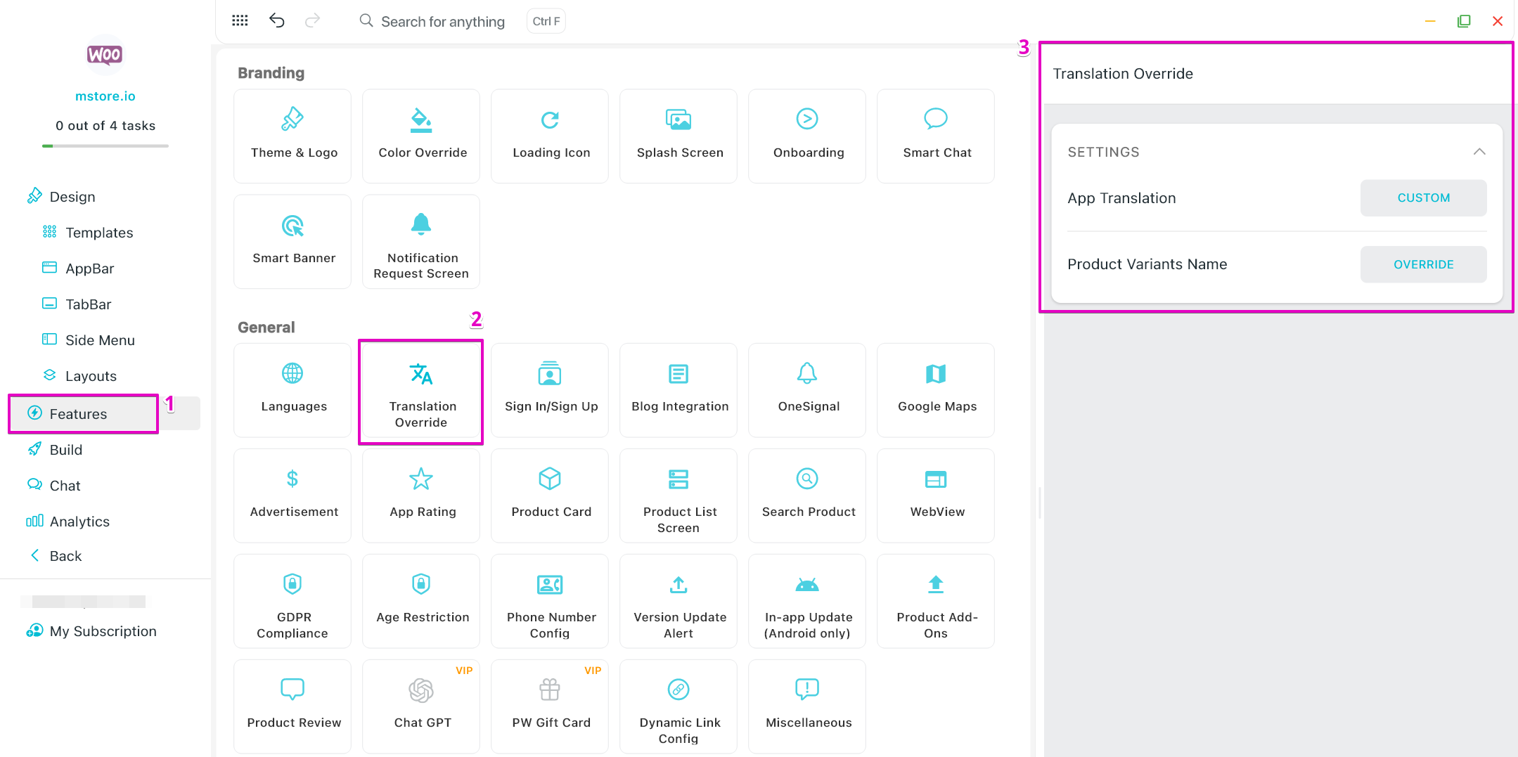
(3) Translation Override
- In older versions of FluxBuilder, you can easily modify text in your apps as needed under "Features > General > Languages"
- In this new version of FluxBuilder 2.1, we have moved from Languages to the new item "Features > General > Translation Override".
- Notably, the Product Variant Name can now be adjusted for each language.
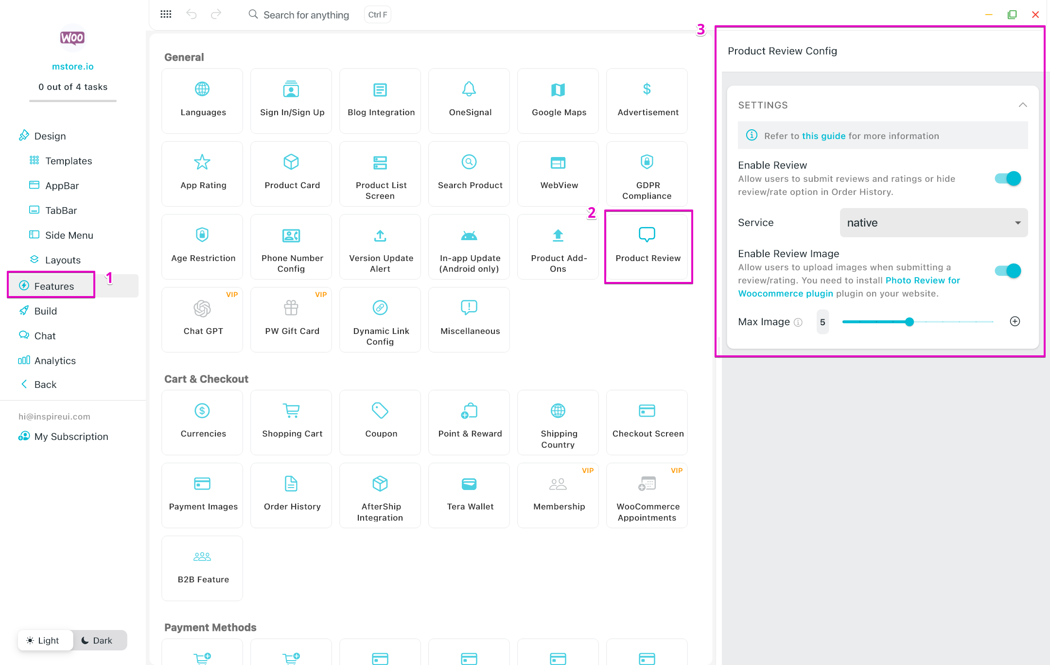
(4) Product Review
Ability to utilize the new Product Review feature to set up the review functionality in your apps.
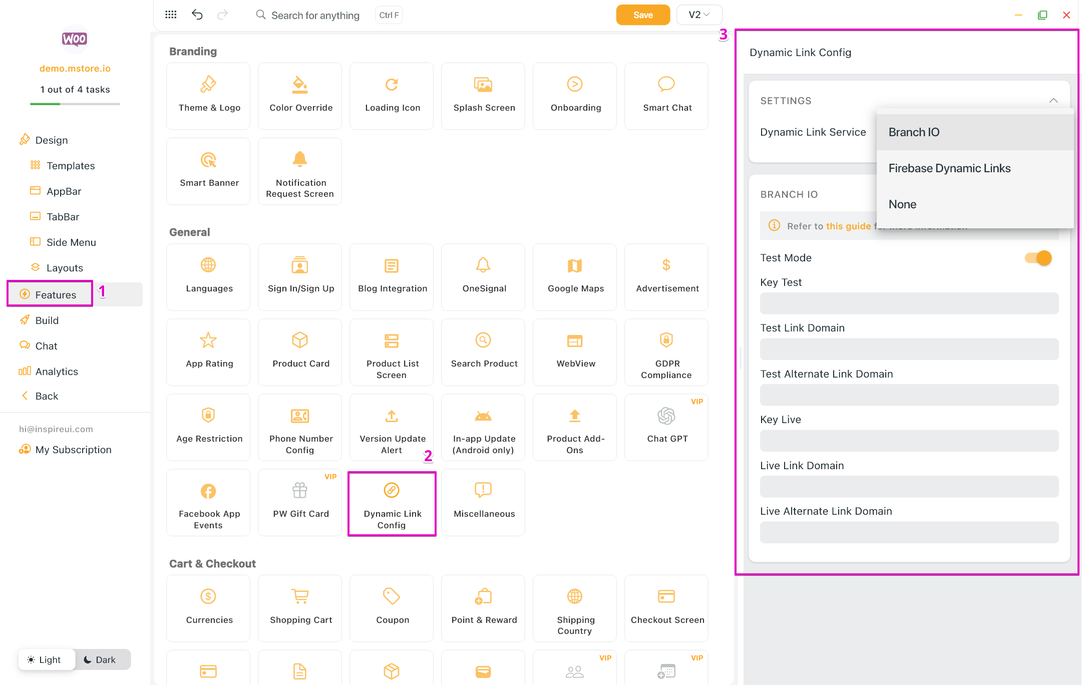
(5) Branch.io Dynamic Links
- According to Firebase's announcement, the Firebase Dynamic Link service will be discontinued on August 25th, 2025. After this date, you will no longer be able to create dynamic links through your Firebase accounts.
- So we support Branch.io Dynamic Links to help you continue using dynamic links for your app. You can configure this feature using the "Dynamic Link Config" option in FluxBuilder:
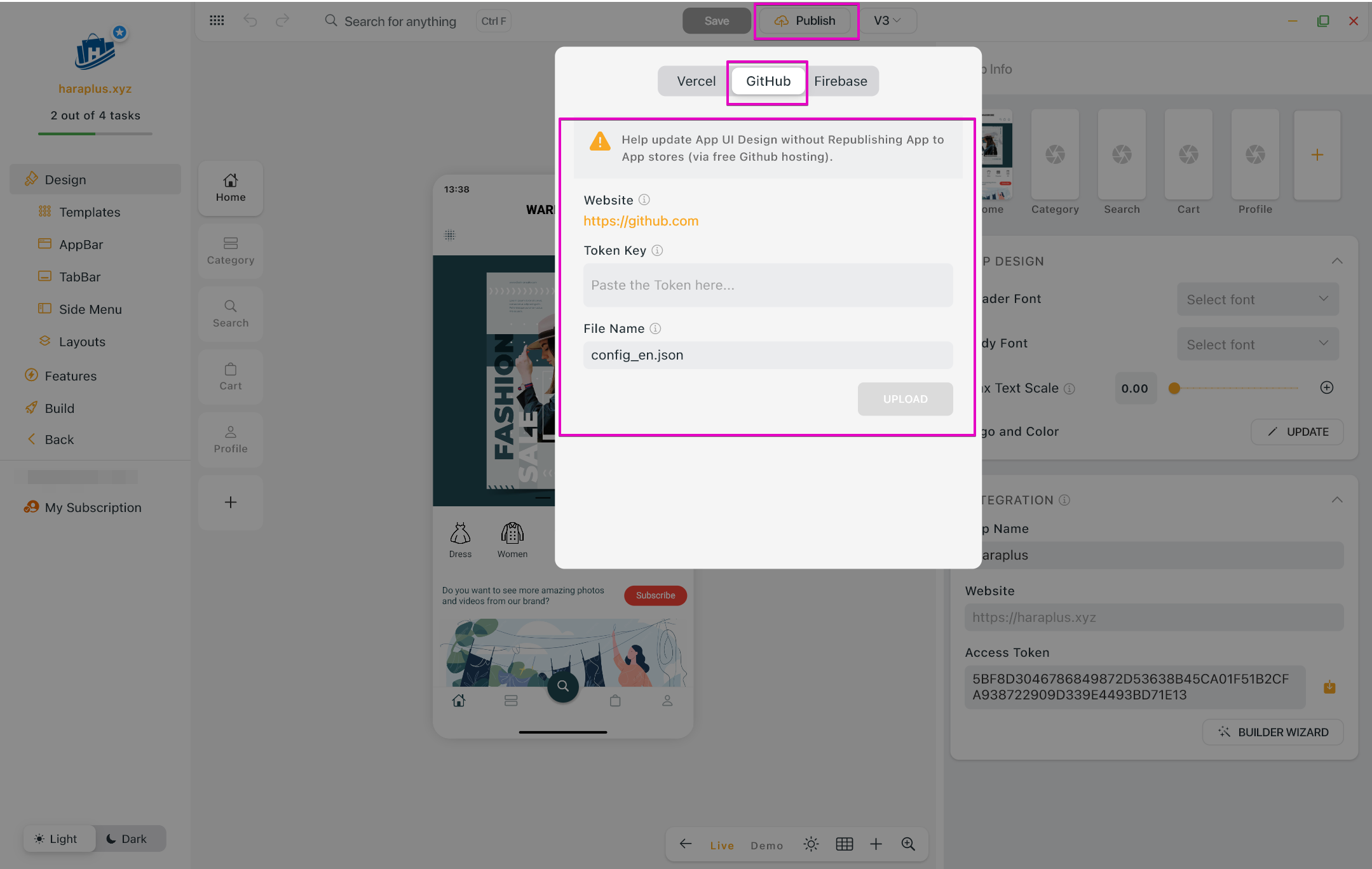
(6) Update App UI via Github
- Ability to update your app design through GitHub without republishing apps to App Stores.
- For multi-language app UI updates, you can upload multiple configuration JSON files. This feature works with both Vercel and GitHub.
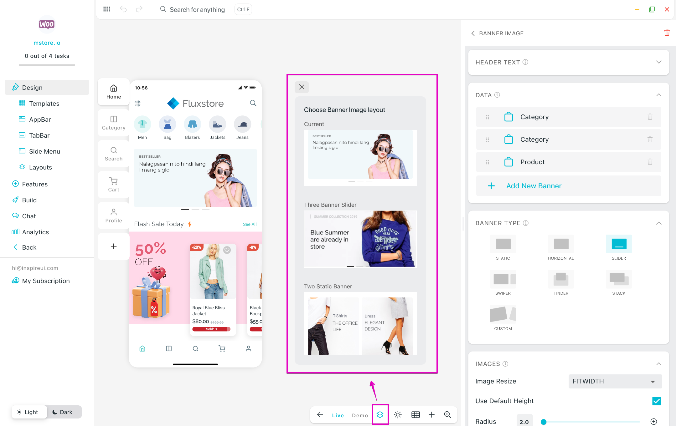
(7) Layout Preview
FluxBuilder has updated the UI for the Home sample layouts. Once you open the layout configuration, a Layout Preview button will appear on the simulator tabbar. Users can access the Layout Preview to apply the sample template or bookmark the current layout for future use.
(8) Animated Stack 💥
- This is new layout for Home screen.
- Capabilities for customizing layouts and implementing animations. The variety of widgets, combined with animation scripts, significantly contributes to the creation of dynamic and engaging app layouts.
- Steps: Design > Home > ADD NEW LAYOUT > Animated Stack.
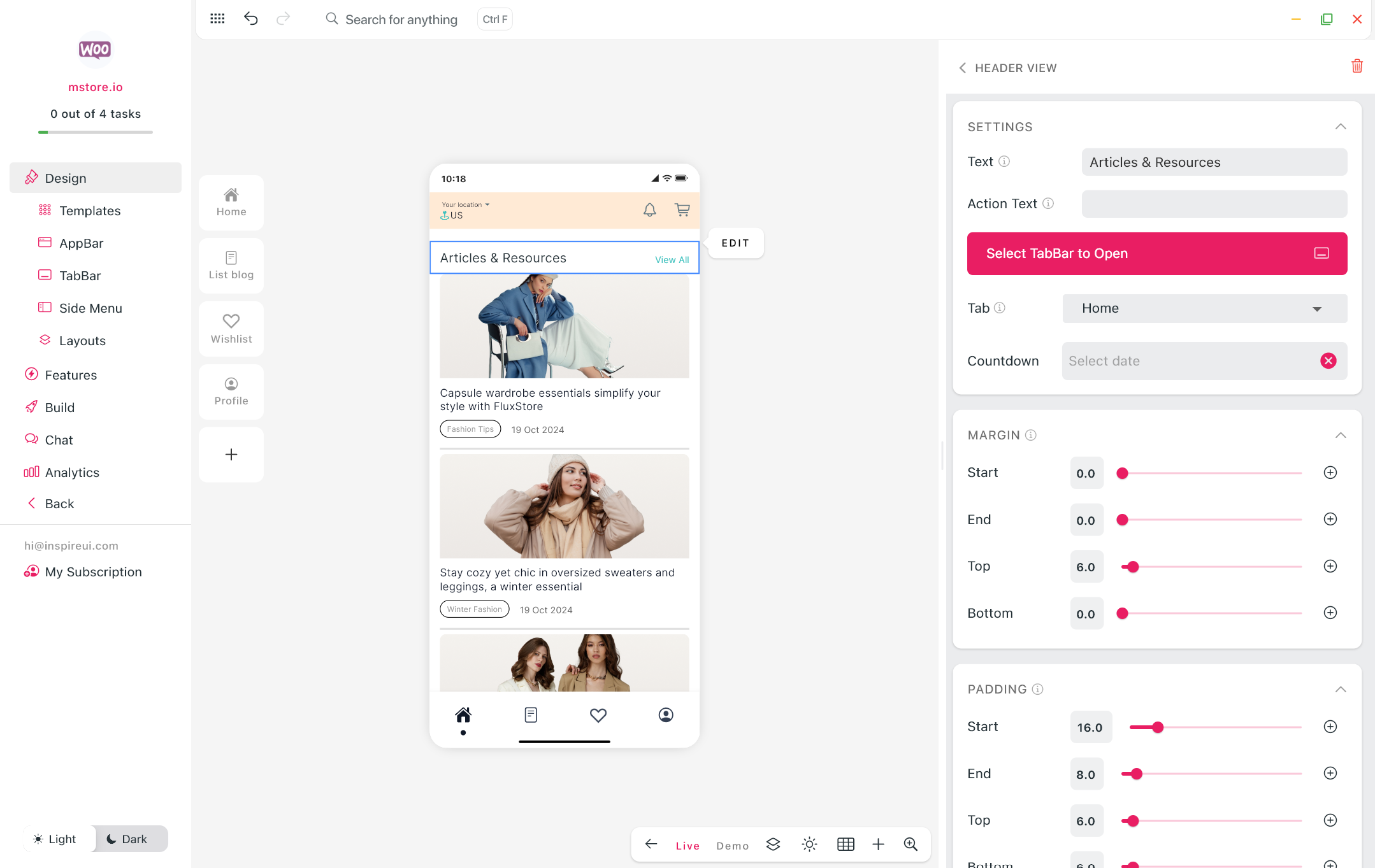
(9) Header View
- This is new layout for Home screen.
- Allow adding a header and link to any page on the app.
- Allow adding a countdown under the Header, supporting any special events.
- Steps: Design > Home > ADD NEW LAYOUT > Header View.
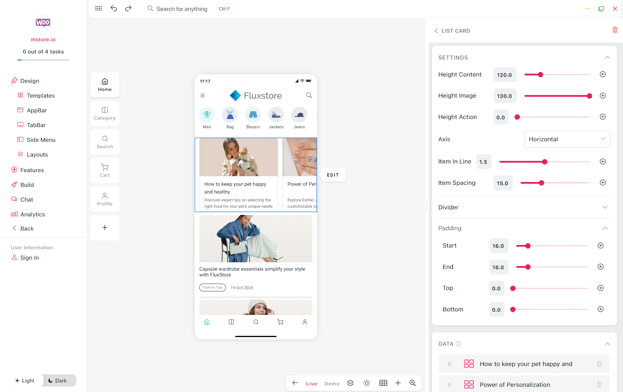
(10) List Card
- This is new layout for the app’s Home screen.
- Steps: Design > Home > ADD NEW LAYOUT > List Card.
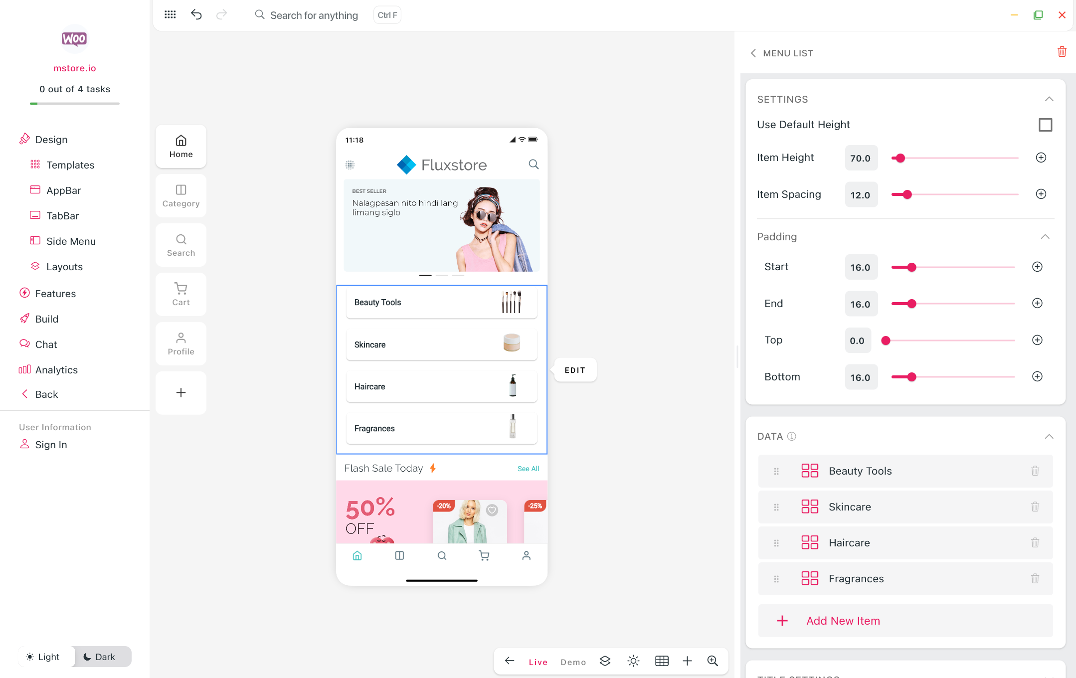
(11) Menu List
- This is new layout for the app’s Home screen.
- Steps: Design > Home > ADD NEW LAYOUT > Menu List.
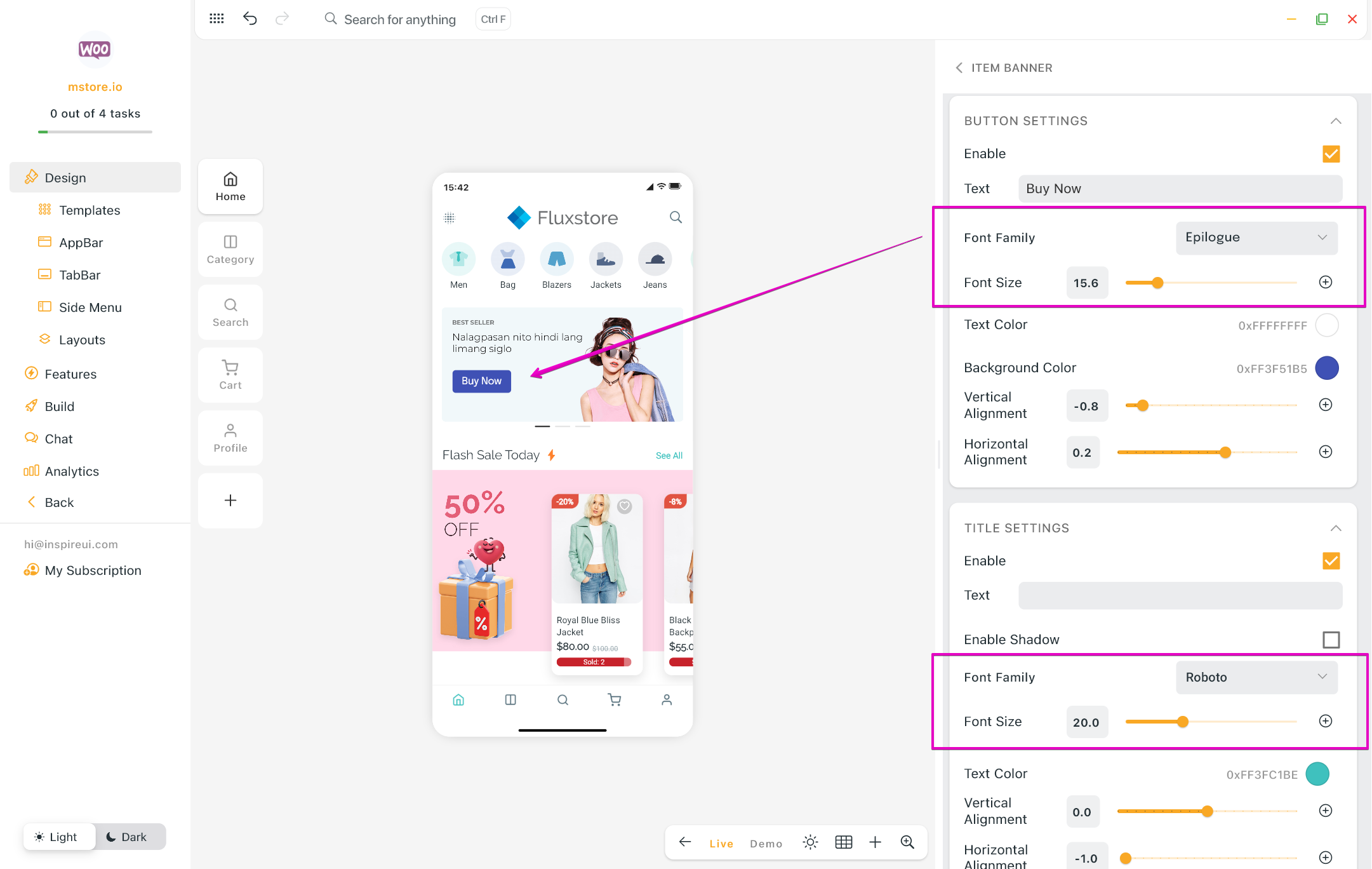
(12) Banner Items: Text Font and Size
You can now adjust text font and size for Button, Title, Description text of banner items on Home screen, providing greater flexibility in design and branding.
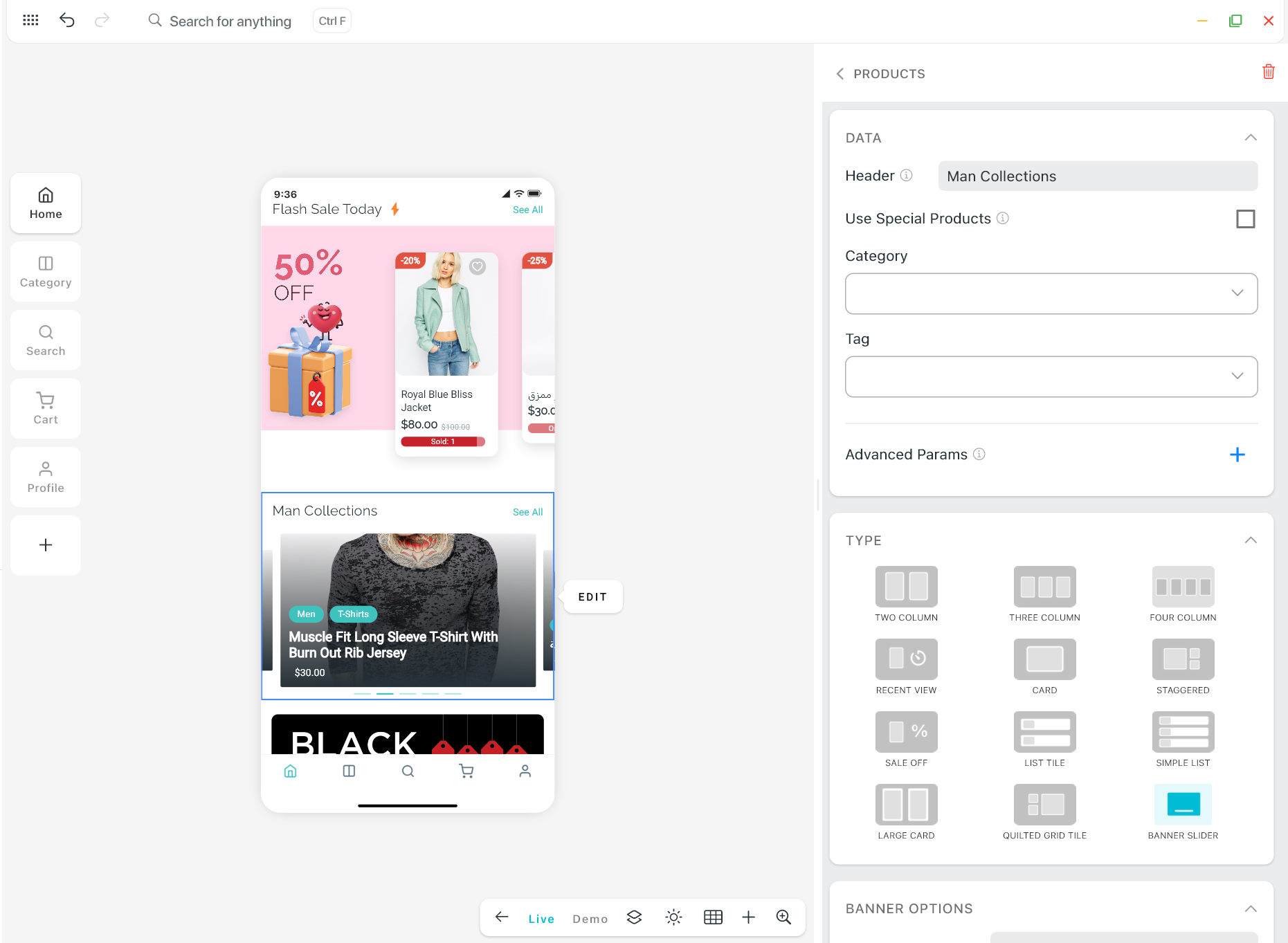
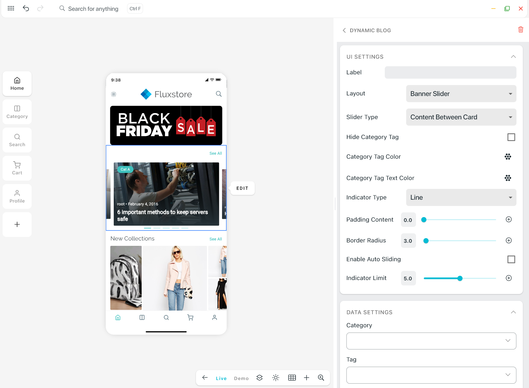
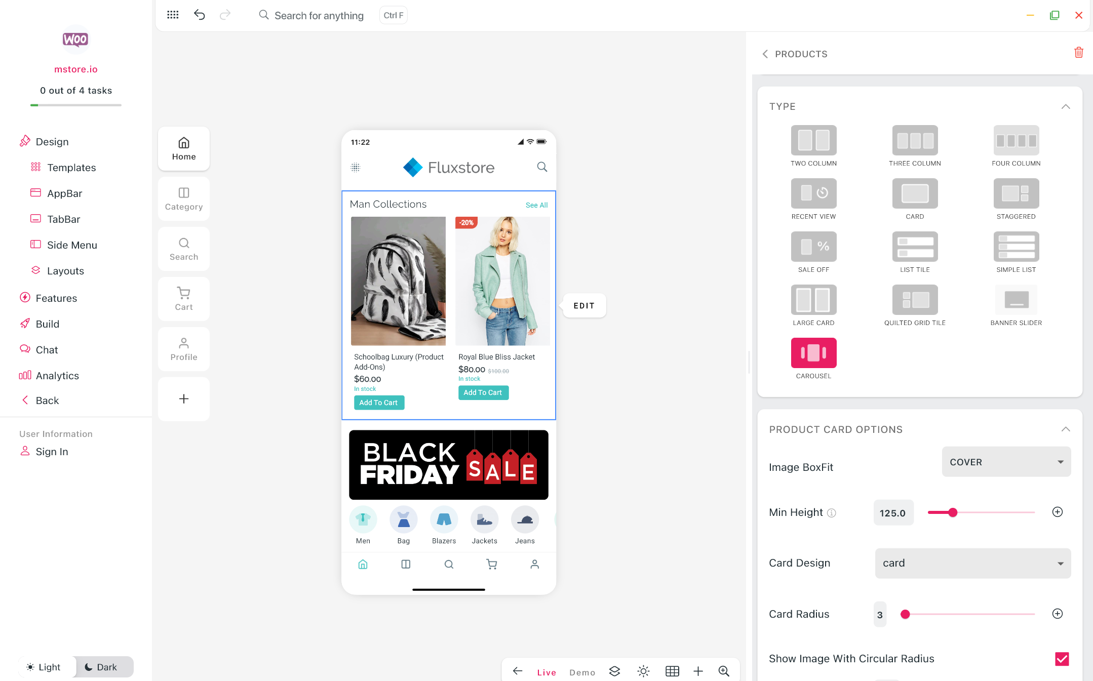
(13) Banner Slider & Carousel
Banner Slider and Carousel are new styles to display Products horizontally and Blog dynamically on the Home screen.
- Banner Slider for Horizontal Products layout (Steps: Design > Home > ADD NEW LAYOUT > Horizontal Products > BANNER SLIDER):
- Banner Slider for Dynamic Blogs layout (Steps: Design > Home > ADD NEW LAYOUT > Dynamic Blog Layout > select Banner Slider in the Layout drop down list):
- Carousel for Horizontal Products layout (Steps: Design > Home > ADD NEW LAYOUT > Horizontal Products > CAROUSEL):
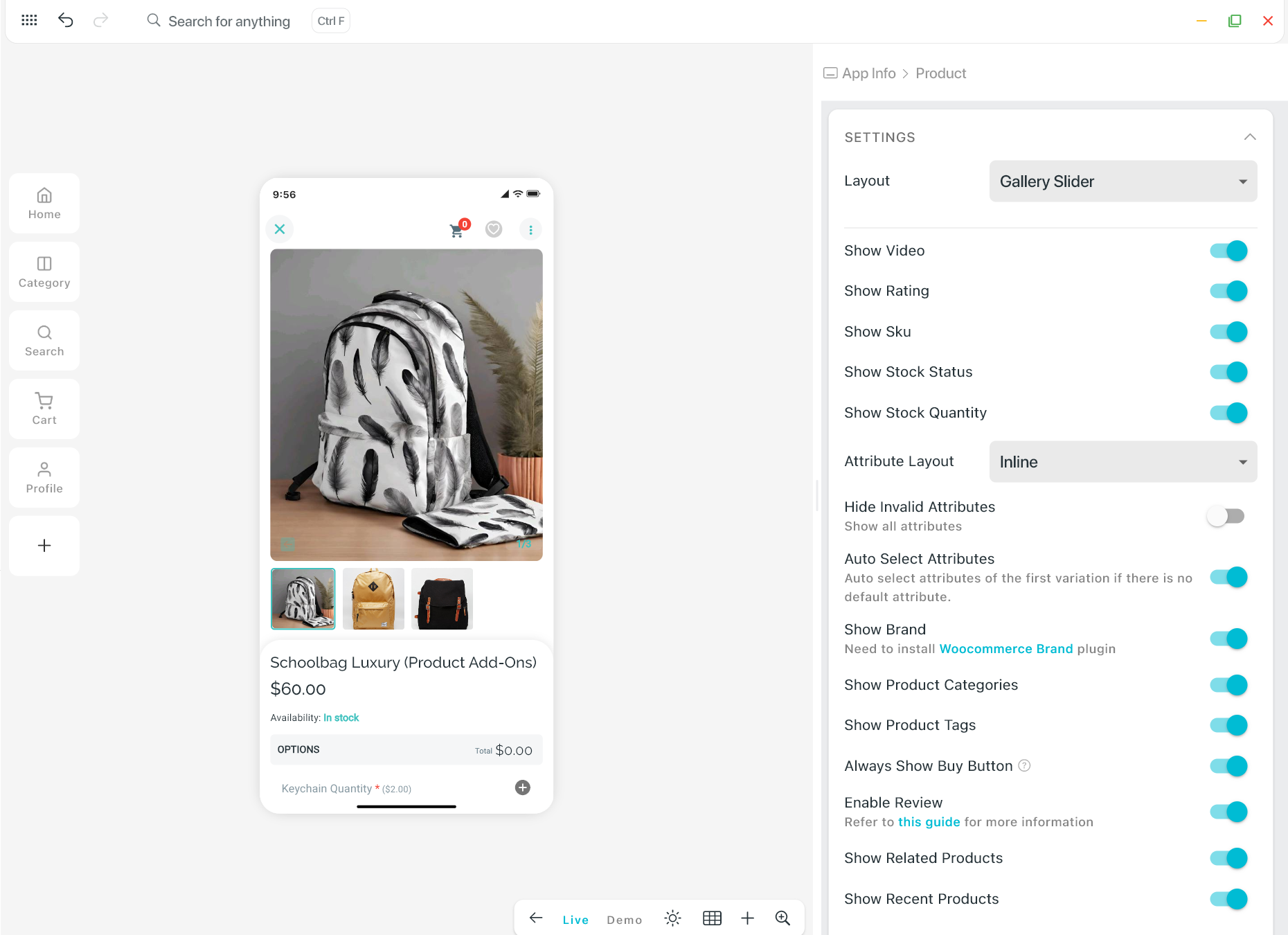
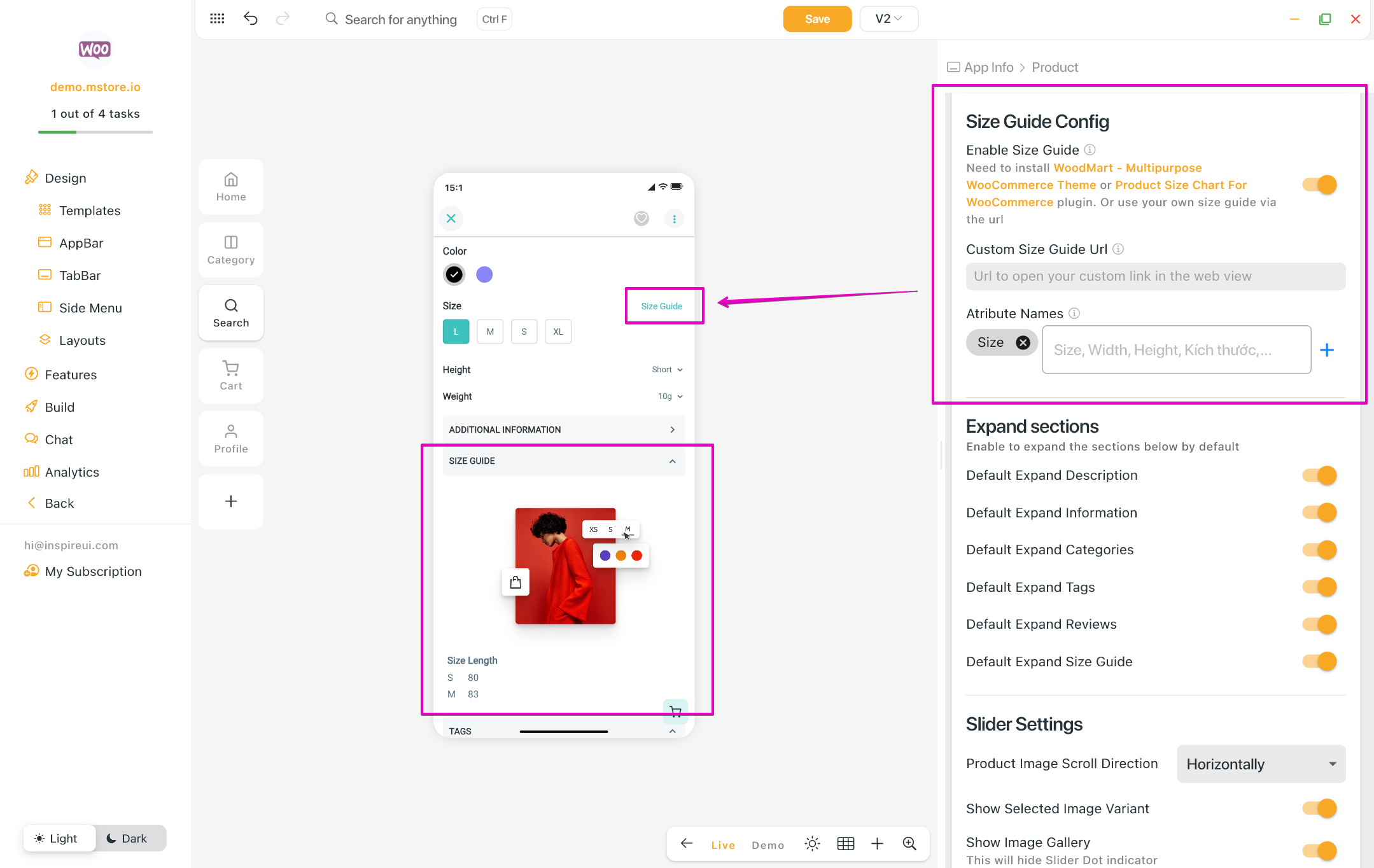
(14) Gallery Slider & Size Guide
Introducing 2 new layouts for the Product Detail screen.
- Gallery Slider (Steps: Design > Home > select a product on Home screen > choose Gallery Slider in the Layout drop down list):
- Size Guide Config support displaying easily the custom size guide buttons on the Product Detail screen. Steps: Design > Home > select a product on Home screen > scroll down to see the Size Guide Config feature:
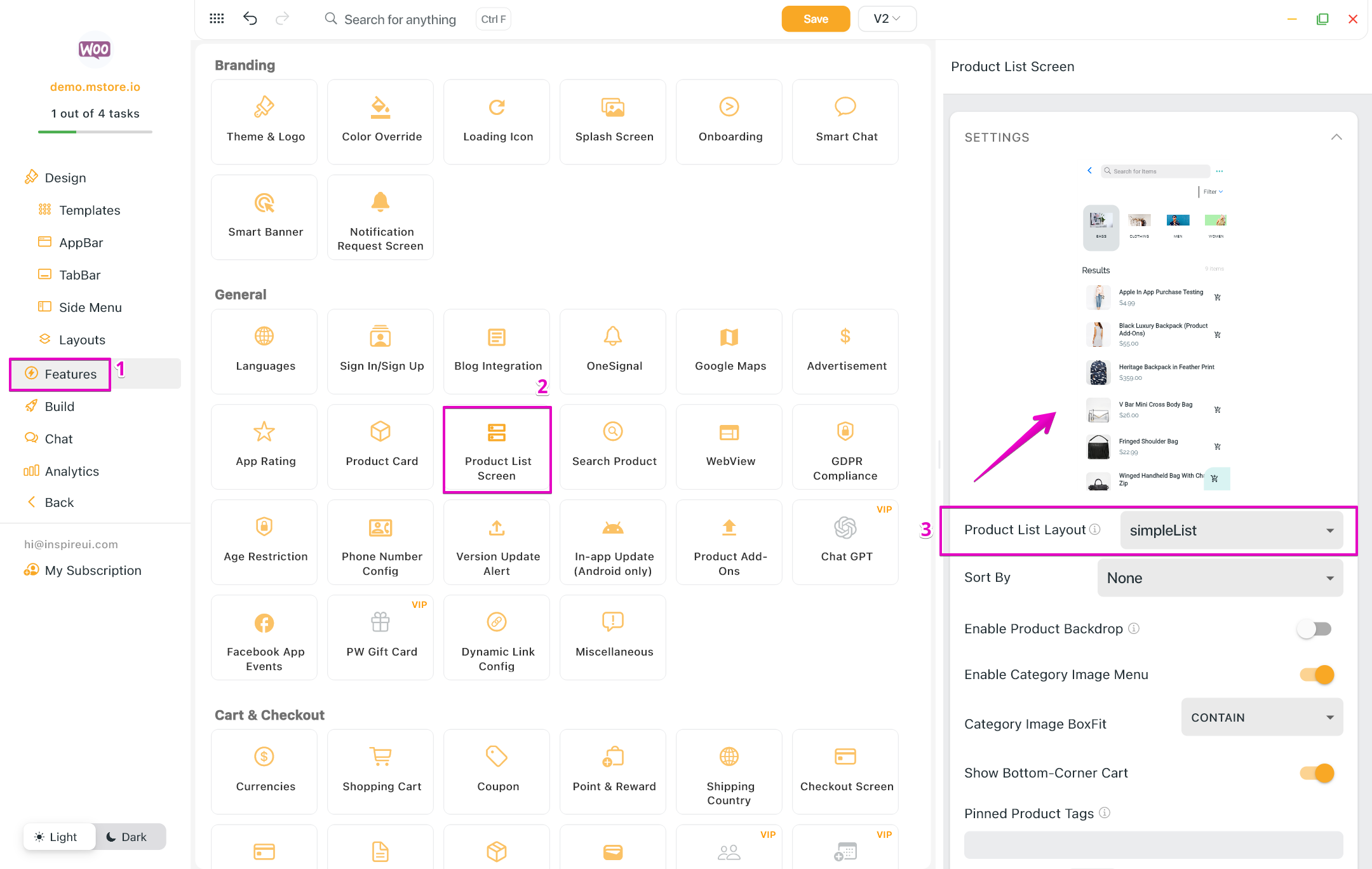
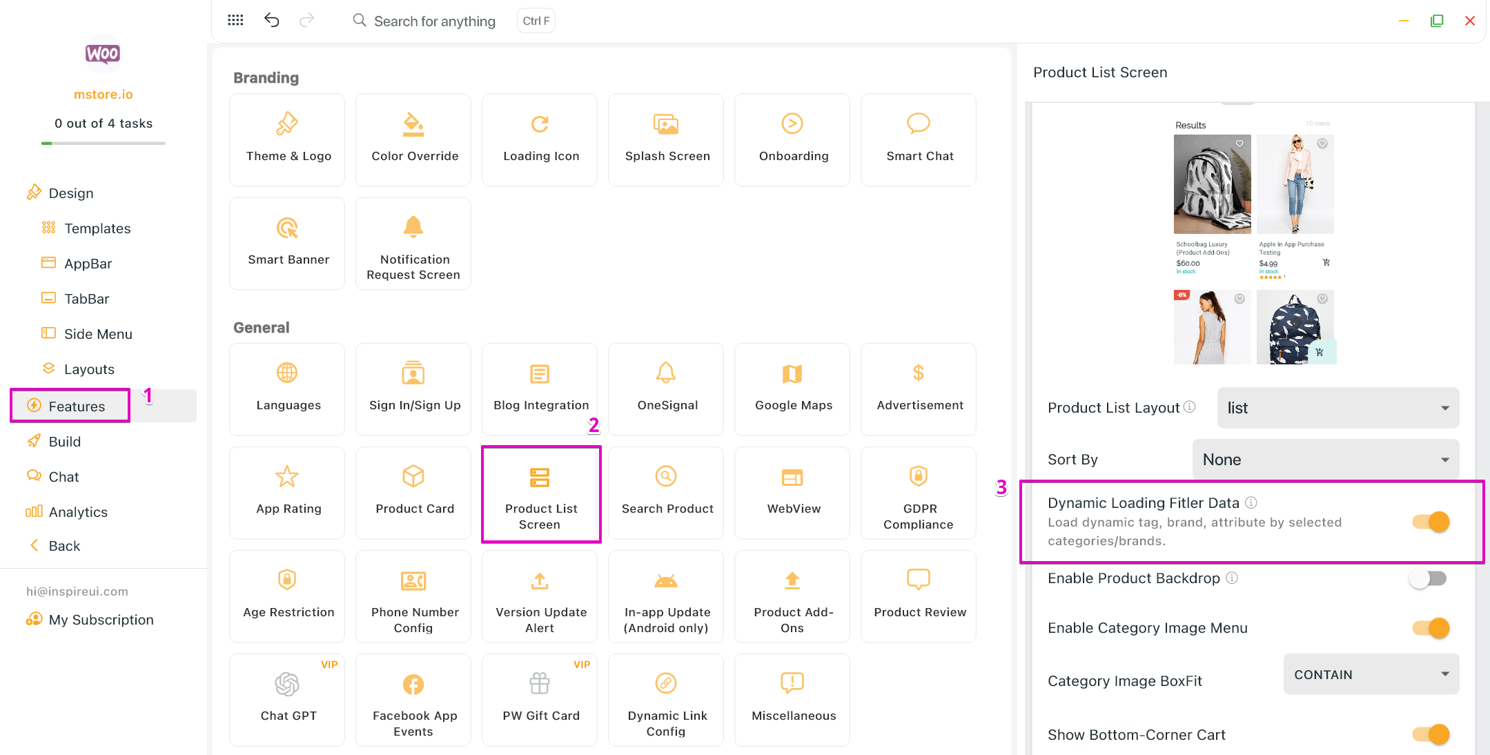
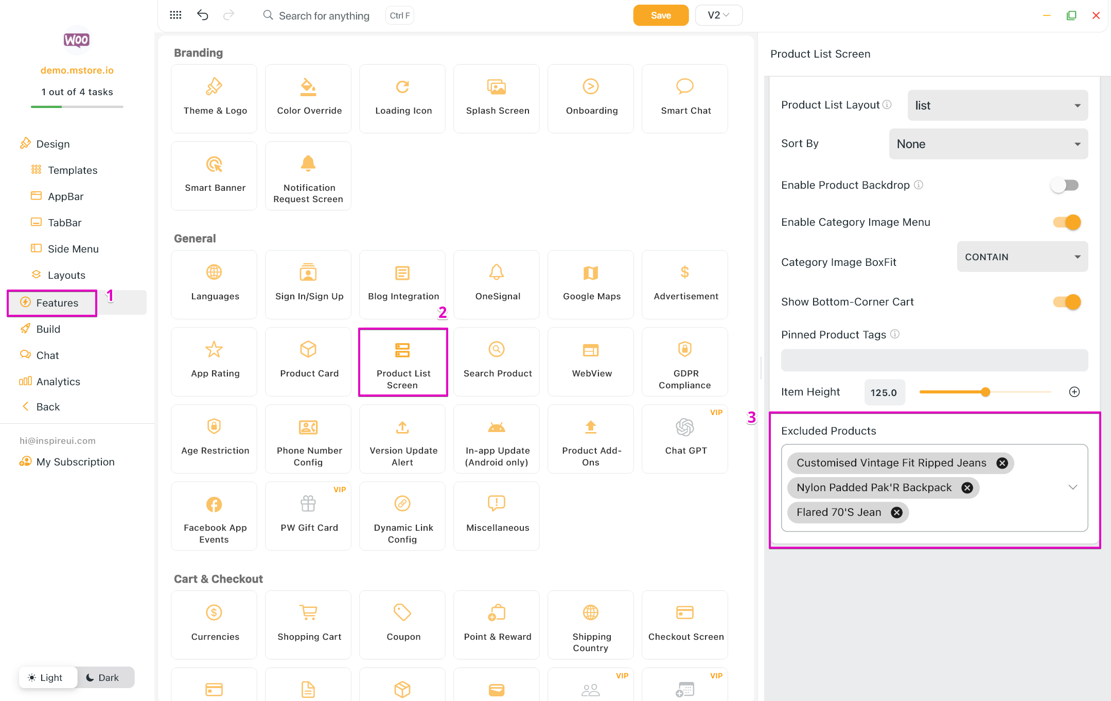
(15) Simple List, Dynamic Loading, Excluded Products
Introducing 2 new features and layout for the Product List screen.
- Simple List: the new simple list layout in the Product List configuration, providing a cleaner and more streamlined way to display products:
- Dynamic Loading for filtering data. The Attributes, Tags, etc. will display as the selected Category or Brand on the filter screen of Product List:
- Excluded Products: easily exclude specific products from the app, enabling better control over displayed inventory:
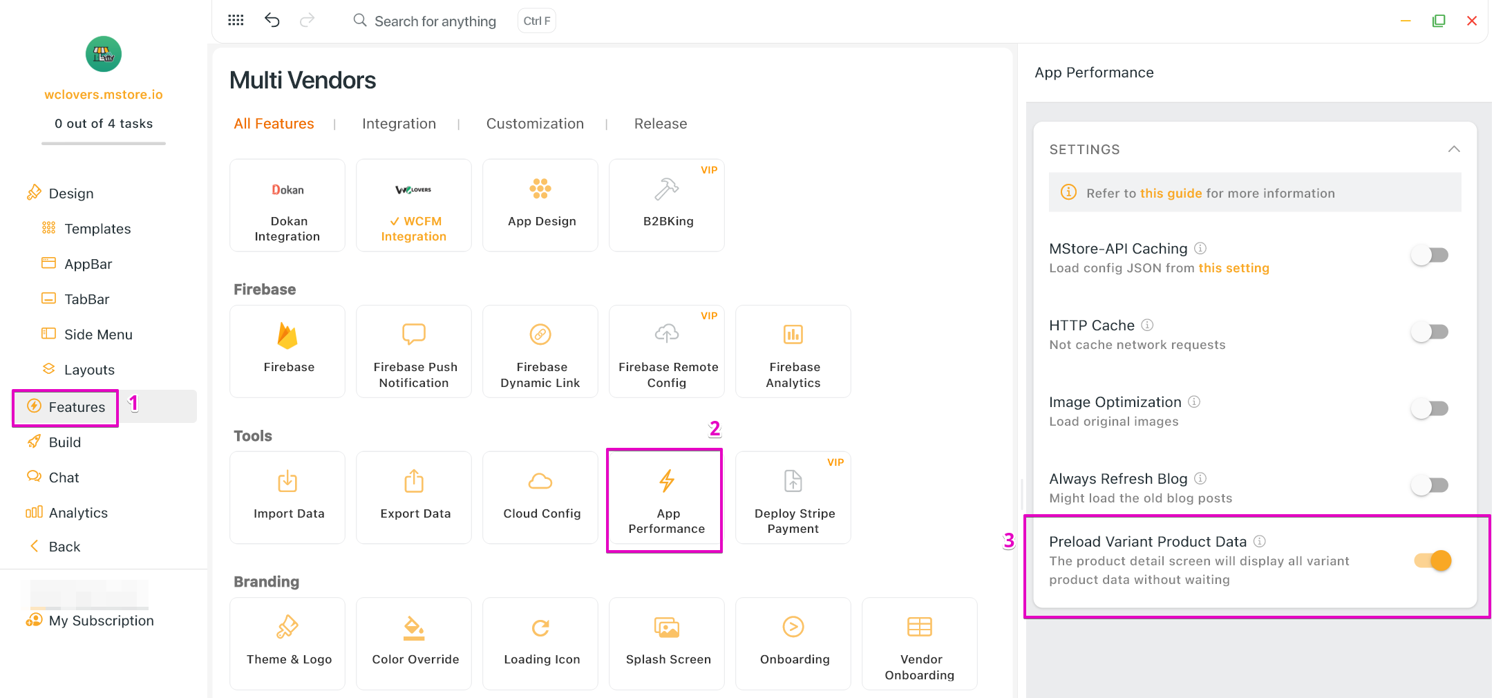
(16) App Performance Improvement
A new way to improve your app performance: Preload Variant Product Data. Quickly enable preloading implementation for variant product data, resulting in faster loading times and a smoother user experience.
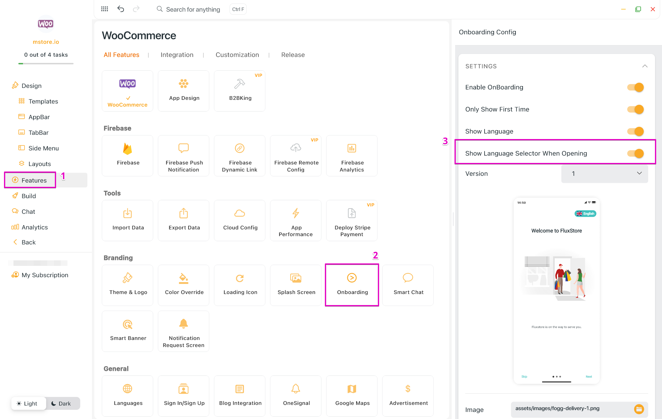
(17) Onboarding screen: Language Selector
The language selector will now be able to display or hide automatically during the onboarding process.
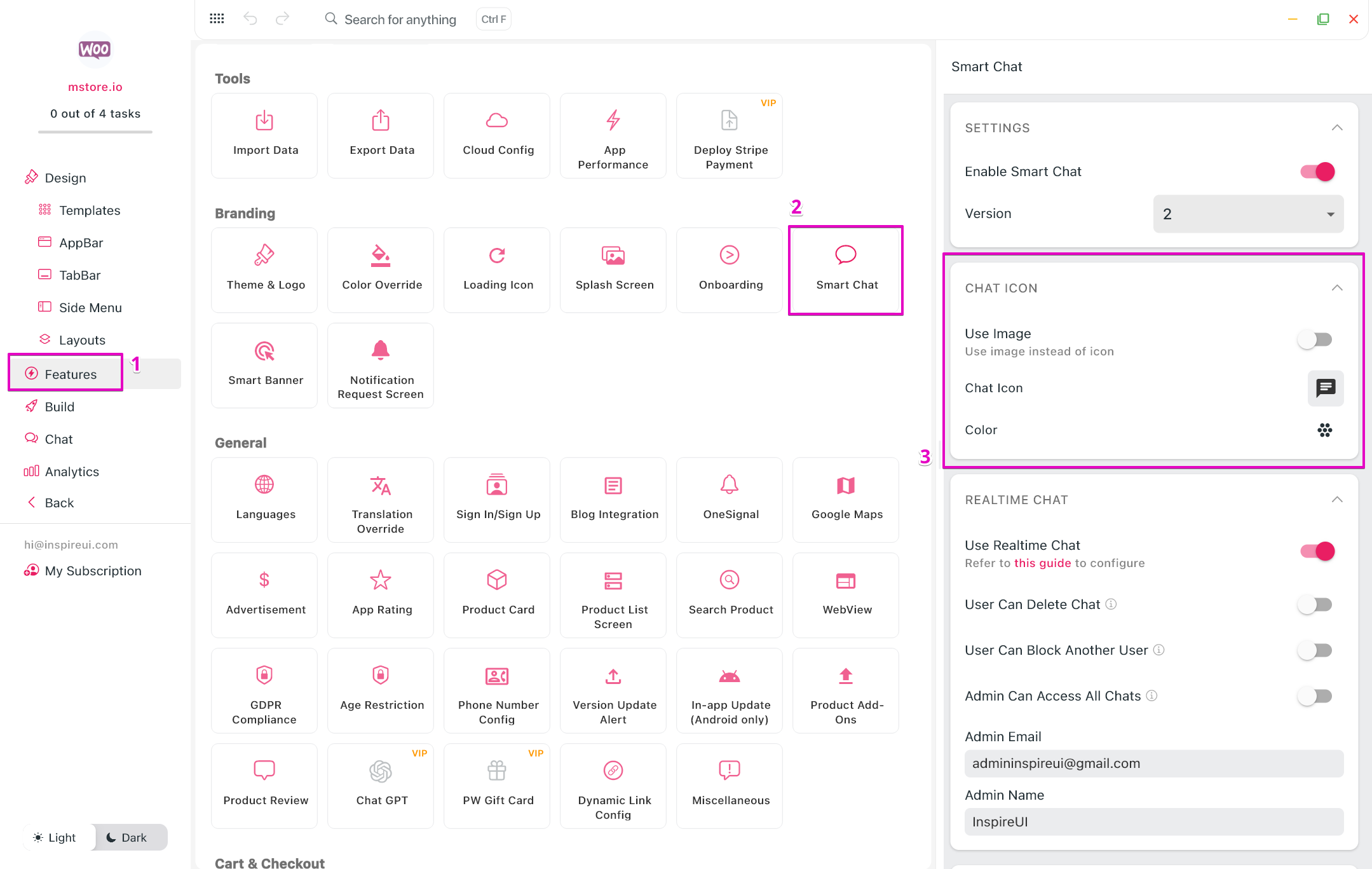
(18) Smart Chat icon
Alternate the default icon of Smart Chat with your chat icon. FluxBuilder allows selecting local images or system icons.
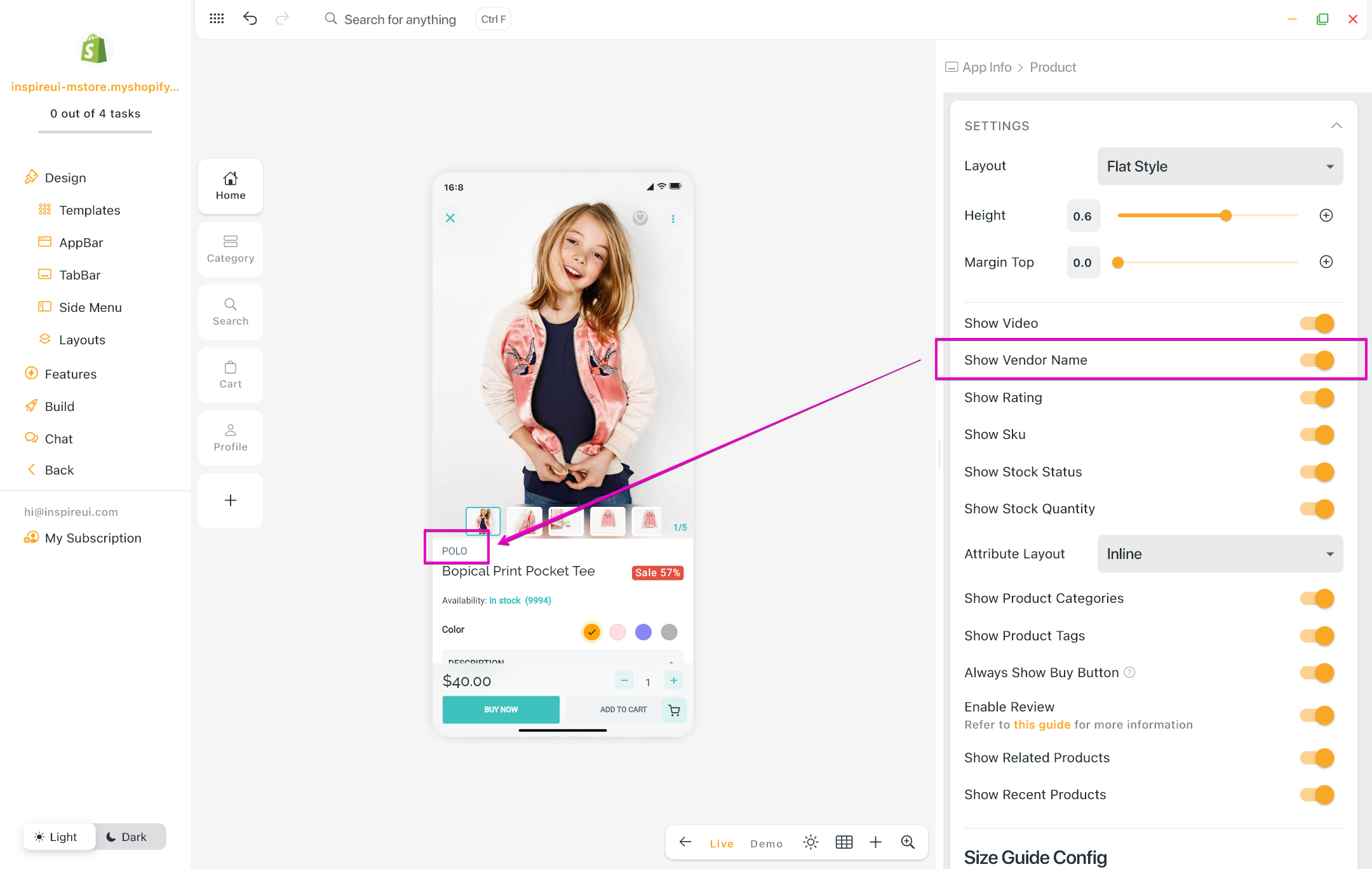
(19) Shopify: Vendor Name
You can now choose to display or hide the vendor name on the Product Details screen of your Shopify app, enhancing product details and transparency.
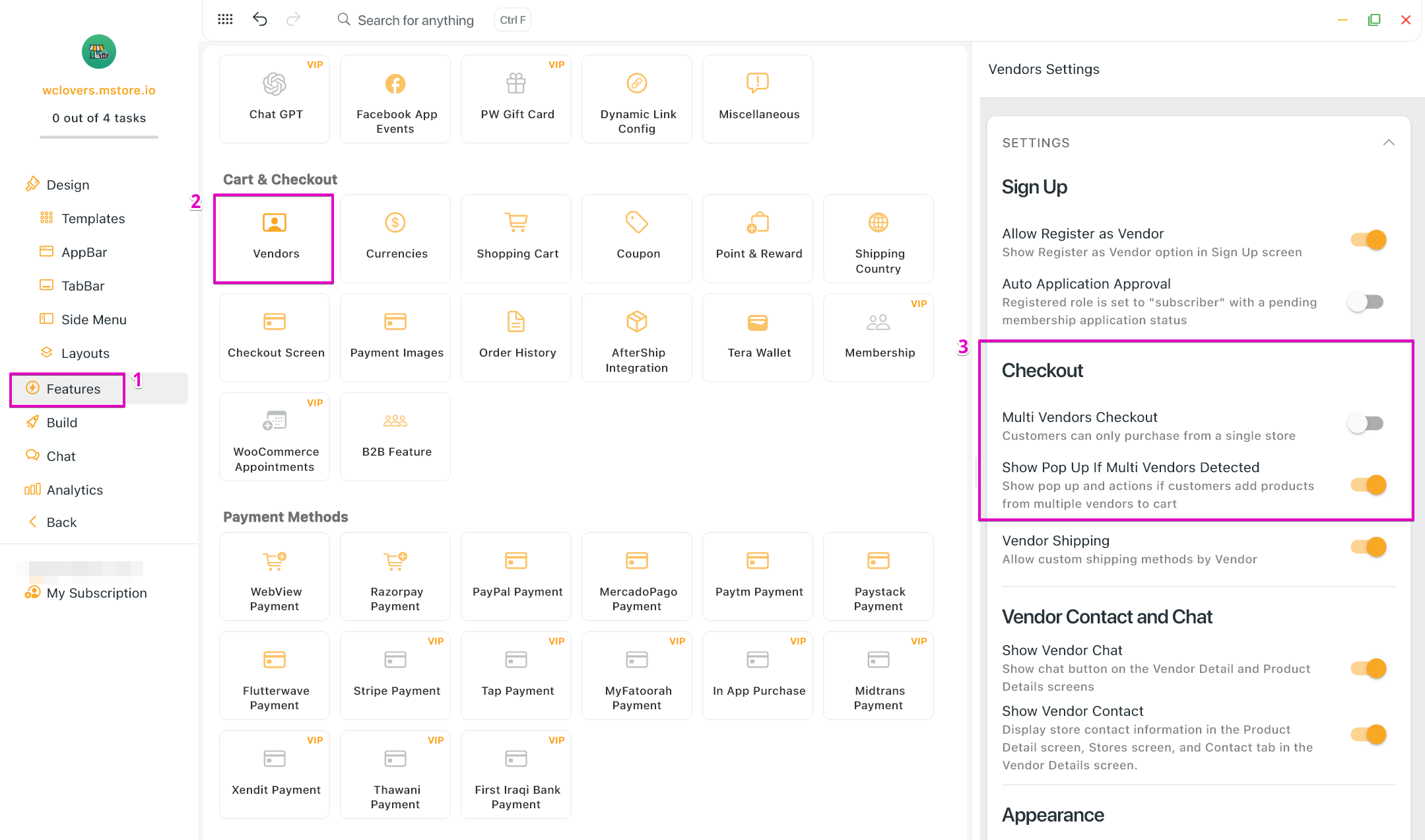
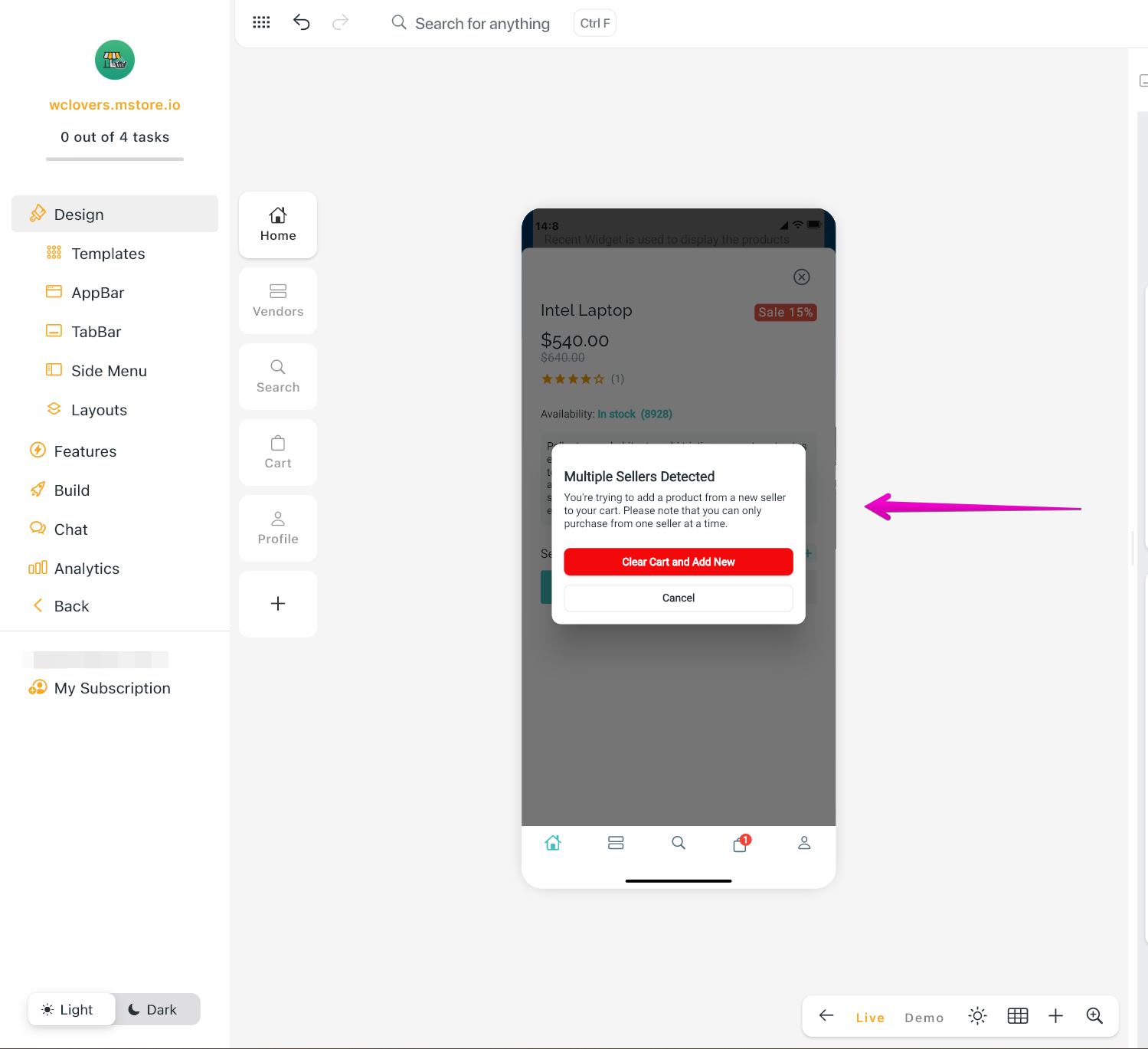
(20) Multi-Vendor: show Pop Up
Ability to turn on a pop-up notification dialog if the multi-vendor checkout is disabled or show a warning message only.
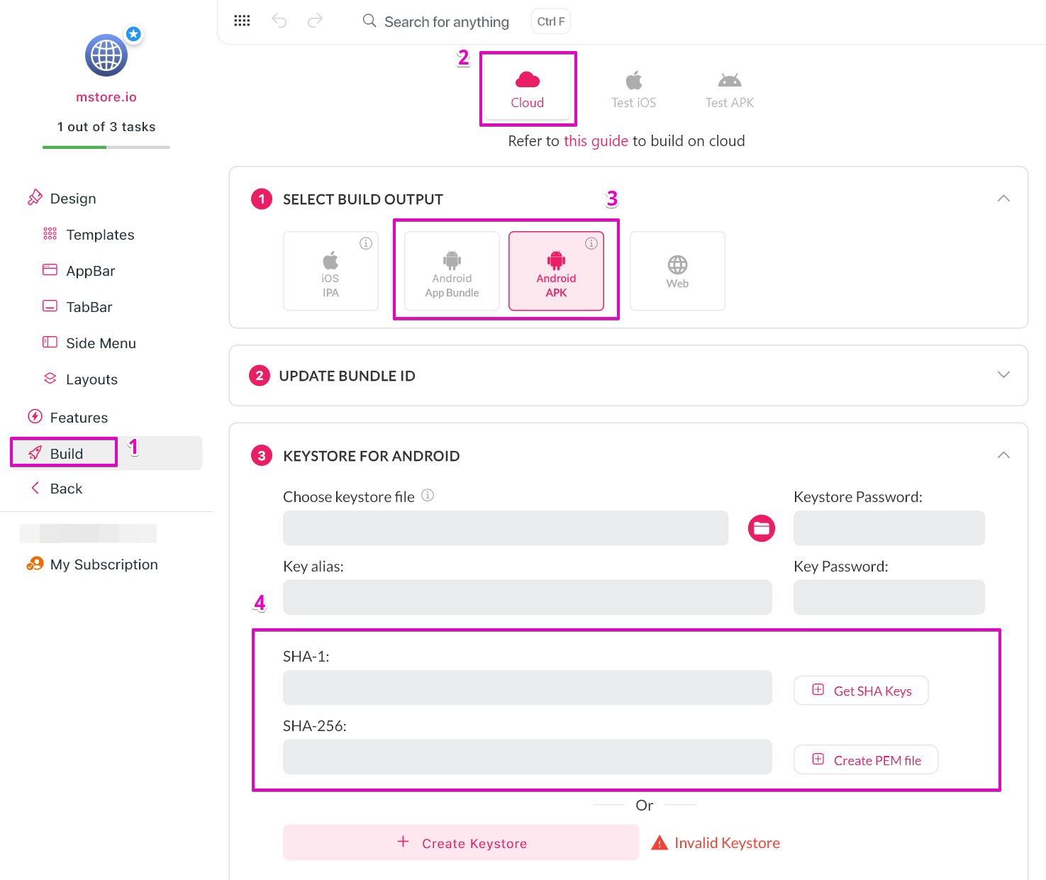
(21) SHA-1, SHA-256, PEM Certificate file
- After updating the Keystore for Android, FluxBuilder supports displaying the SHA-1 and SHA-256 keys for users to utilize as needed.
- Besides, a PEM certificate file can be easily created from this version.
(22) FluxBuilder Social Login
The new feature simplifies the login process, allowing users to access the tool quickly and securely without the need for creating a separate account.