Version 2.0.4
Version 2.0.4 - October 6th, 2023
(1) Compatible with the latest macOS Sonoma
The new version is compatible with the latest release of macOS and supports iOS 17.
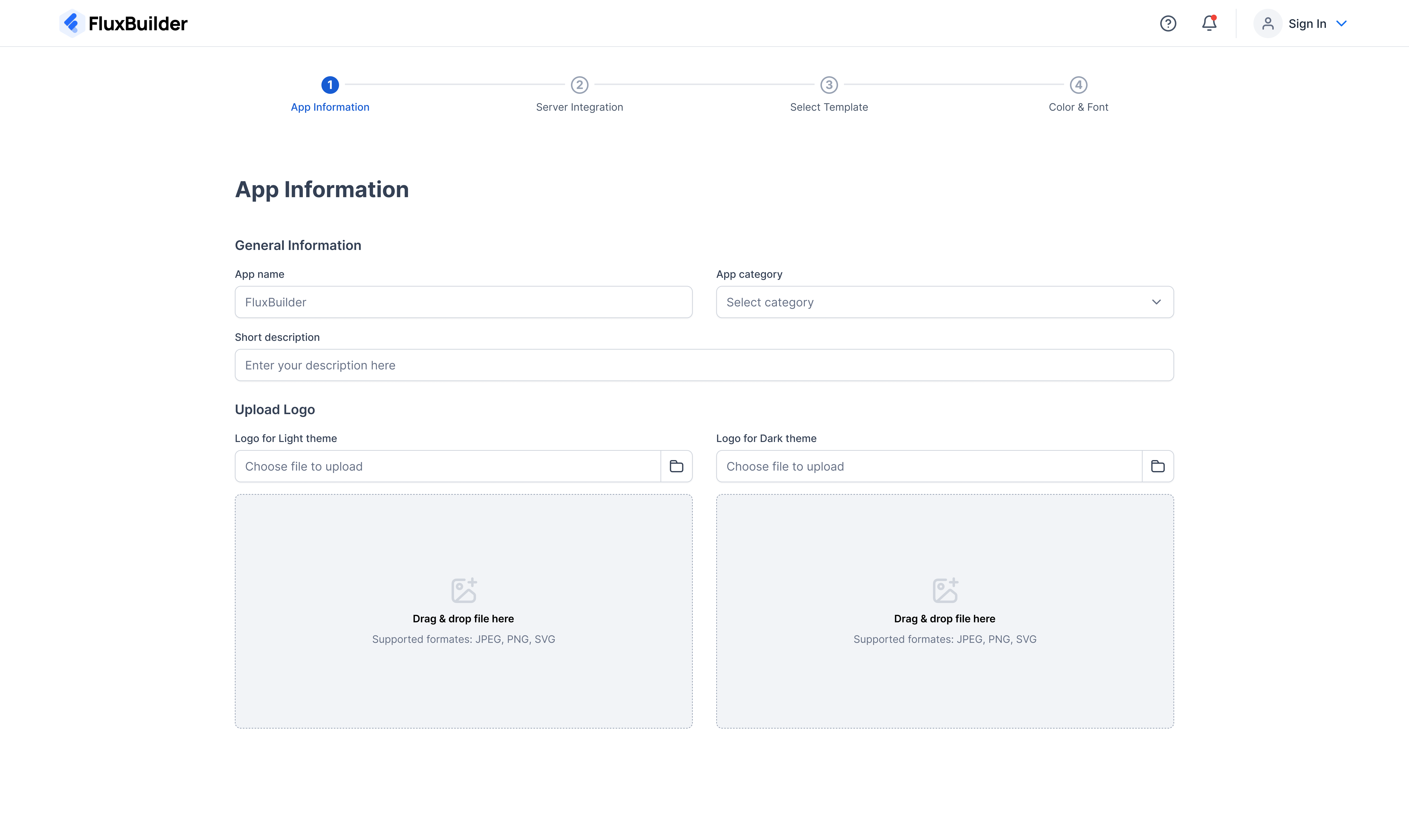
(2) New App Creation UI 💥
When you click “Create New App”, new UI is useful and easy to input the basic information for your App.
Demo Screenshot
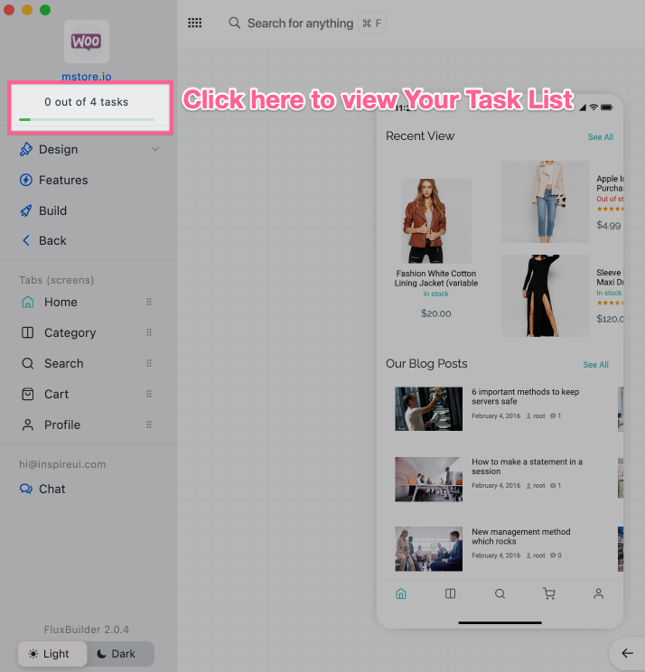
(3) Task List Location
- In version 2.0.4, the Task List is moved to the Top Left position so you can easily see it.
- Task List will display all basic tasks that you need to customize before auto-build your mobile apps (API, APK, AAB).
- This is very useful for newbies (in case you find there are too many features and don't know which one to do first).
Demo Screenshot
Open your app or a Featured App, you will see Task List progress bar. Click it.
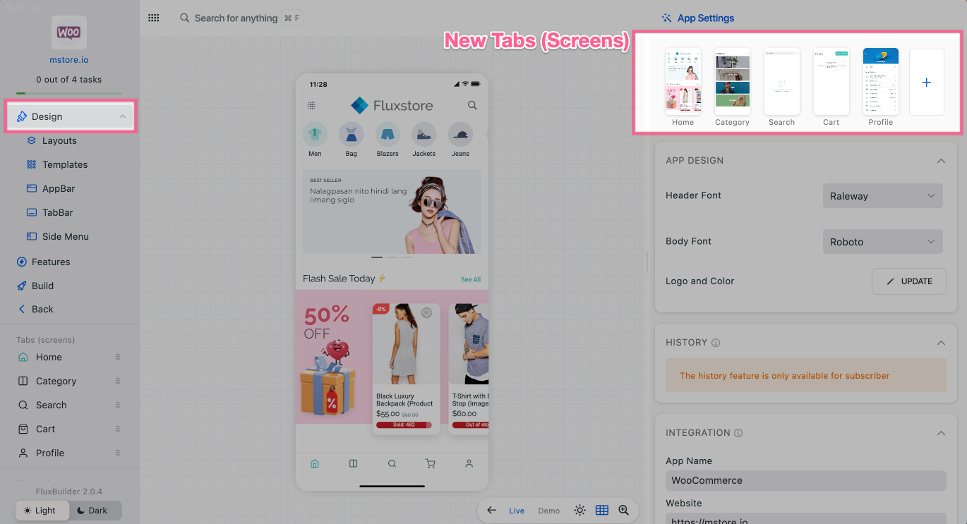
(4) Tabs (Screens) Location
- In this latest version, the Tabs (or Screens) section is moved to the Right panel.
- This new UX saves space on the left menu and increases ease of use. (especially on FluxBuilder Web version).
- Demo Screenshot: Open your app or a Featured App. Then click Design on the left menu to see New Tabs location:
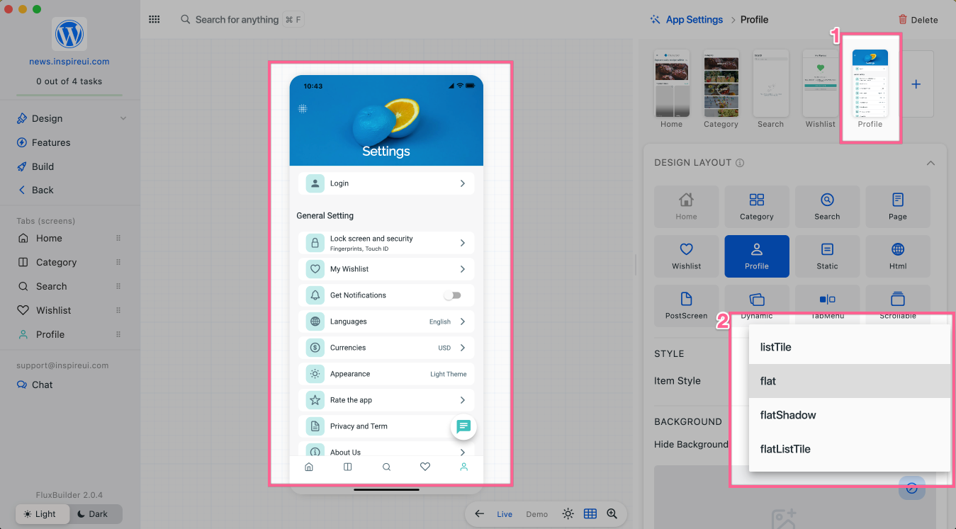
(5) New Settings Screen Styles
FluxBuilder 2.0.4 has 4 styles for the Profile screen and allow hide the Background.
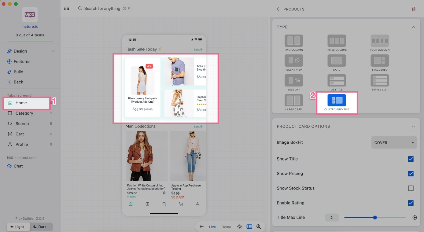
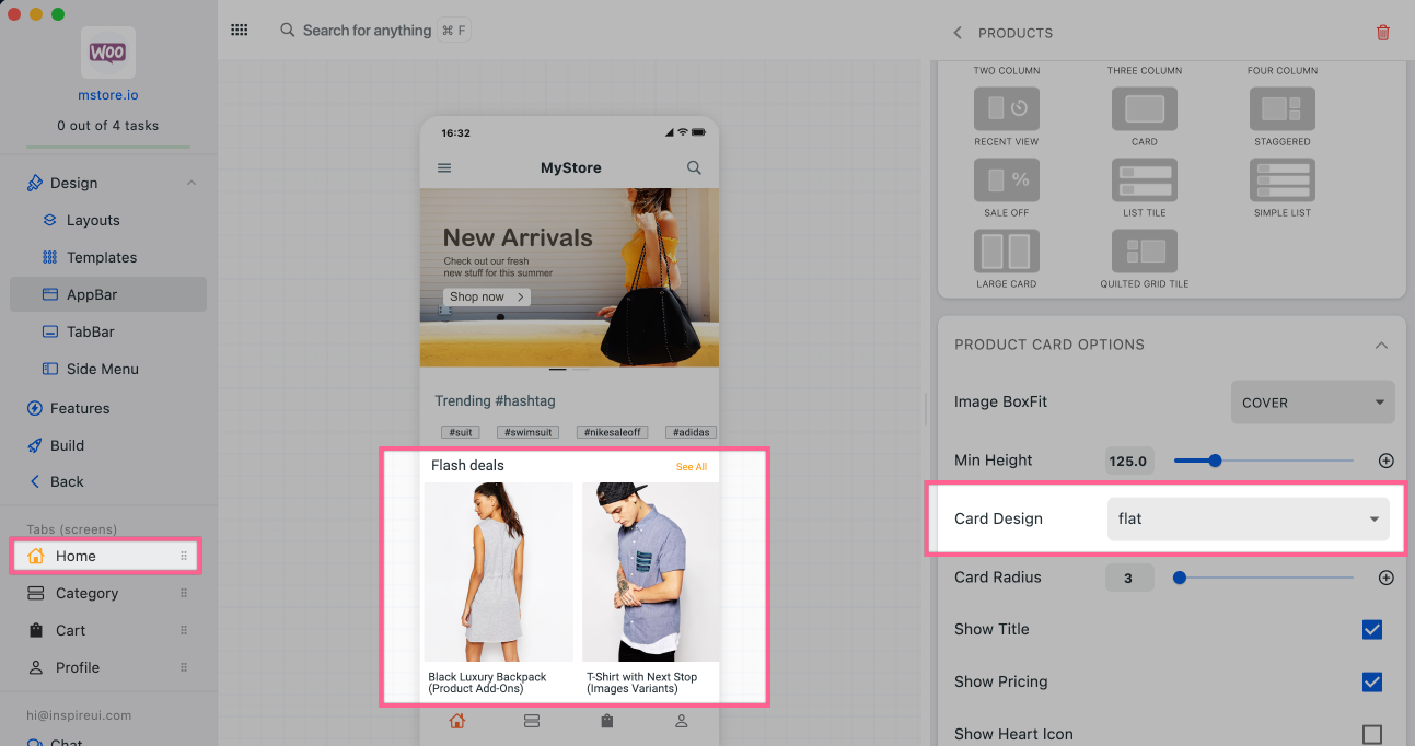
(6) New Horizontal Products Layout
- Quilted Grid Tile - new beautiful UI of Horizontal Products layout.
- The Horizontal Products layout support SimpleCard.
Demo Screenshot
To show these new UI on Home tab, open an app. Then select Home, add/edit Horizontal Products, scroll down on the right panel and select TYPE QUILTED GRID TILE.
- Quilted Grid Tile:
- SimpleCard:
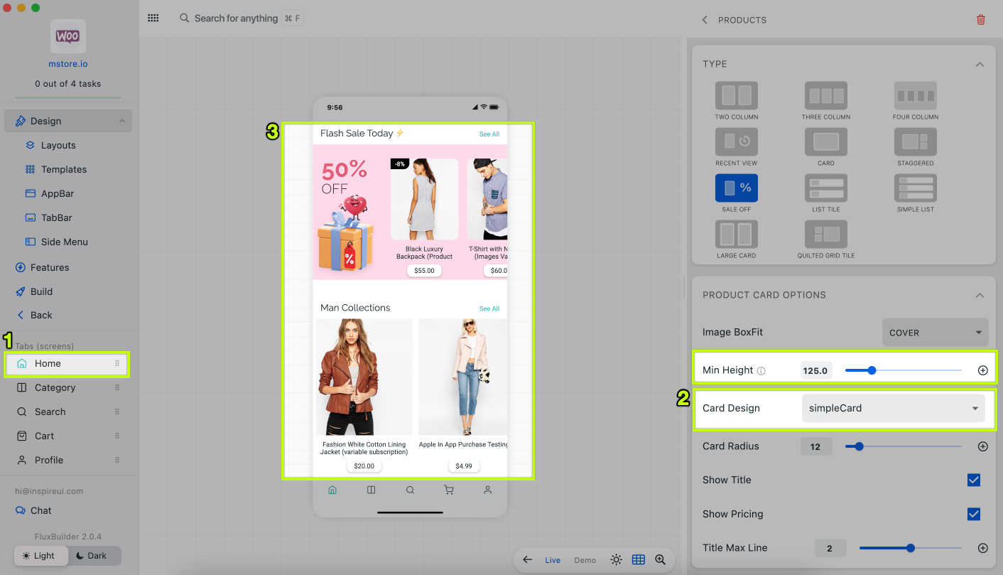
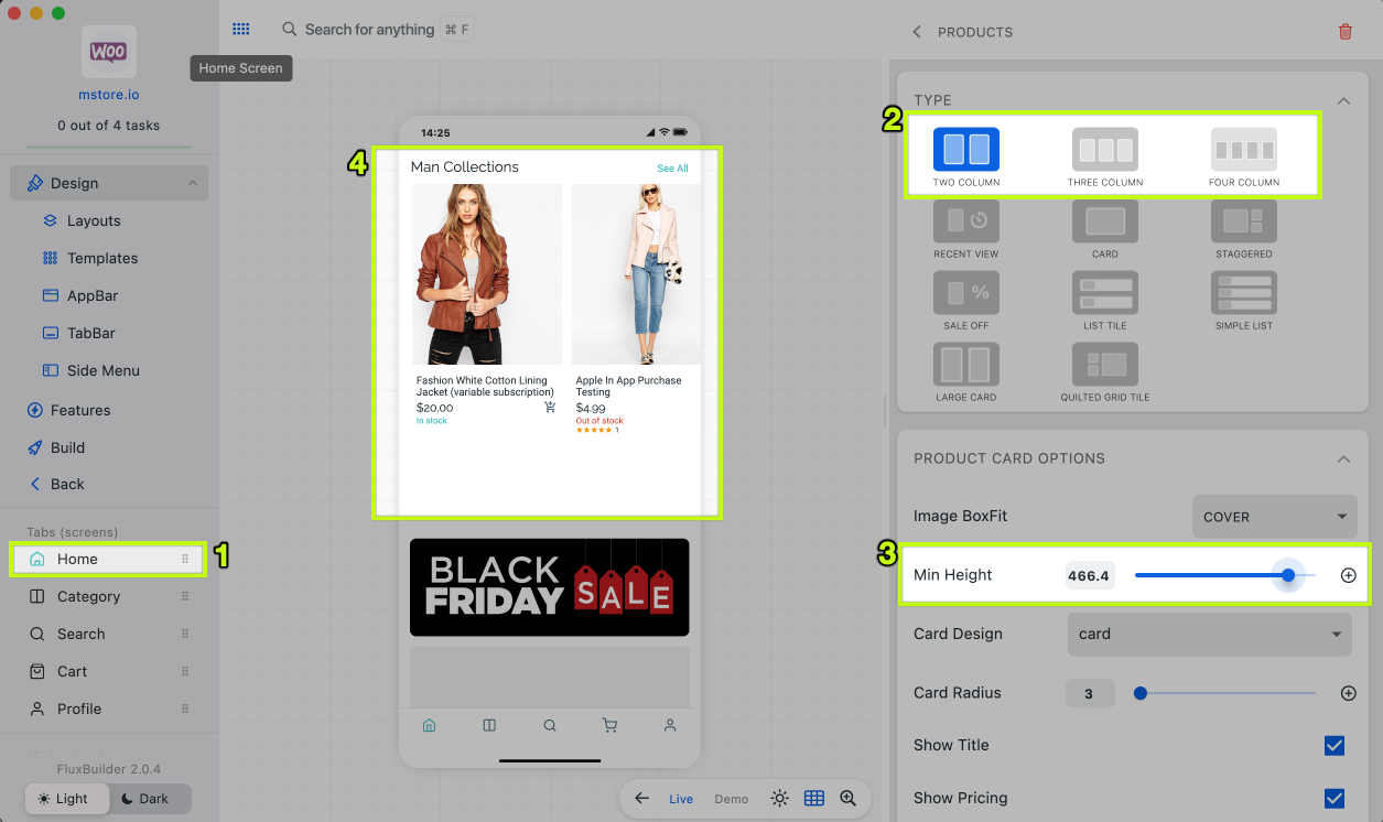
Horizontal Products has new Min Height
- FluxBuilder 2.0.4 has
Min Heightto easily change the height of this layout. - To see
Min Height, please go to an app, selectHome, edit/add aHorizontal Products, select Type: Two Column, Three Column, Four Column, or Card.
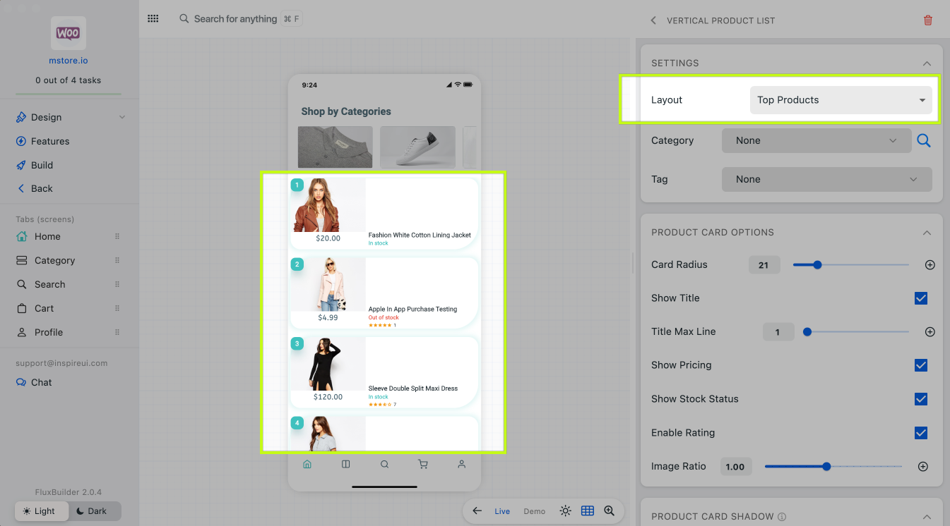
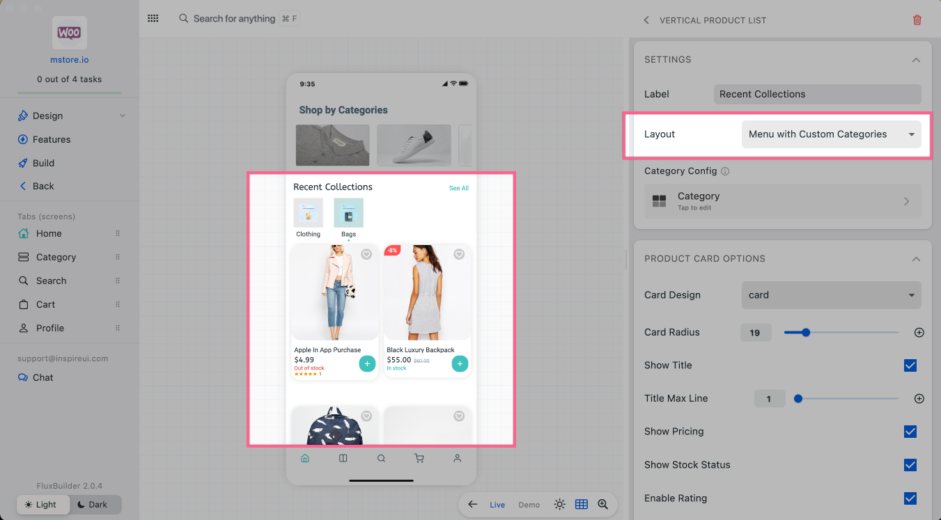
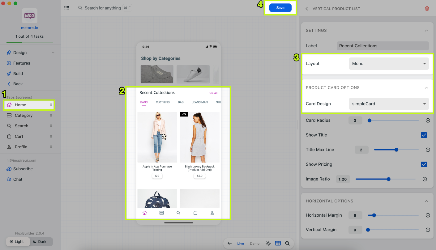
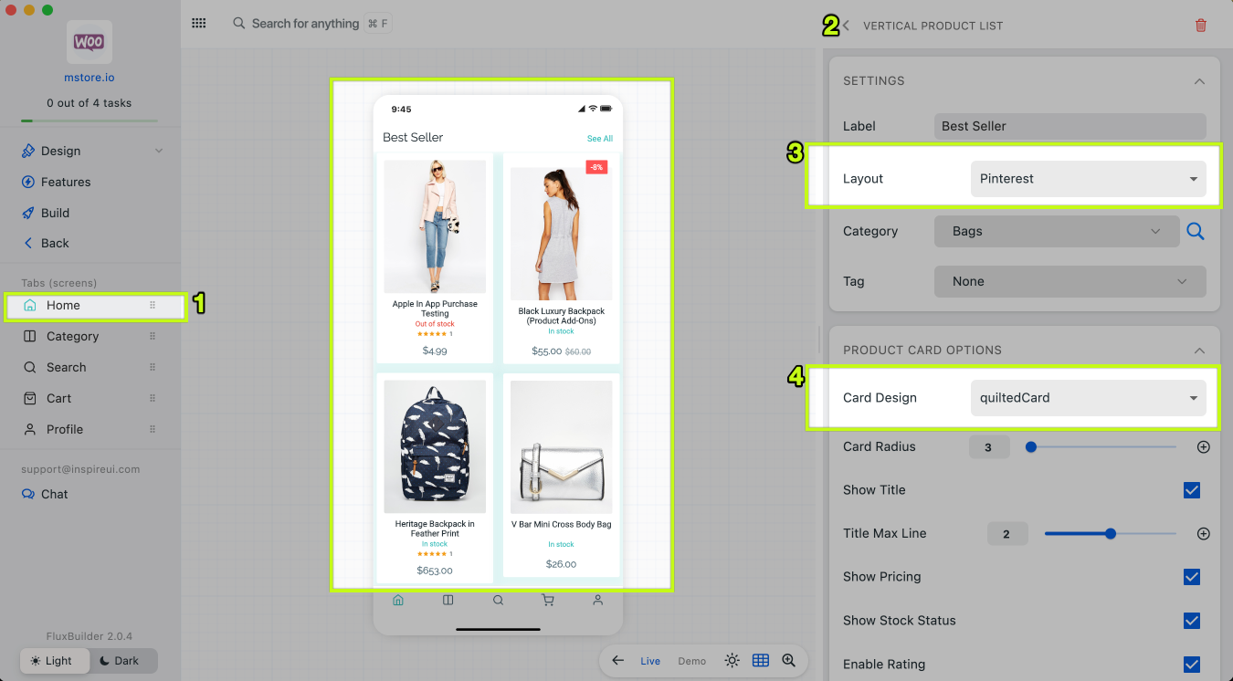
(7) New Vertical Layouts
Top Products and Menu with Custom Categories are new useful UI for Vertical Layout.
The Menu layout supports SimpleCard.
The Pinterest layout supports QuiltedCard.
Demo Screenshot
- To show these UIs on Home tab, open an app. Then select
Home, add/editVertical Layout, selectLayout. - Top Products:
- Menu with Custom Categories:
- SimpleCard (in Menu layout):
- QuiltedCard (in Pinterest layout):
- To show these UIs on Home tab, open an app. Then select
(8) Design Upgrades
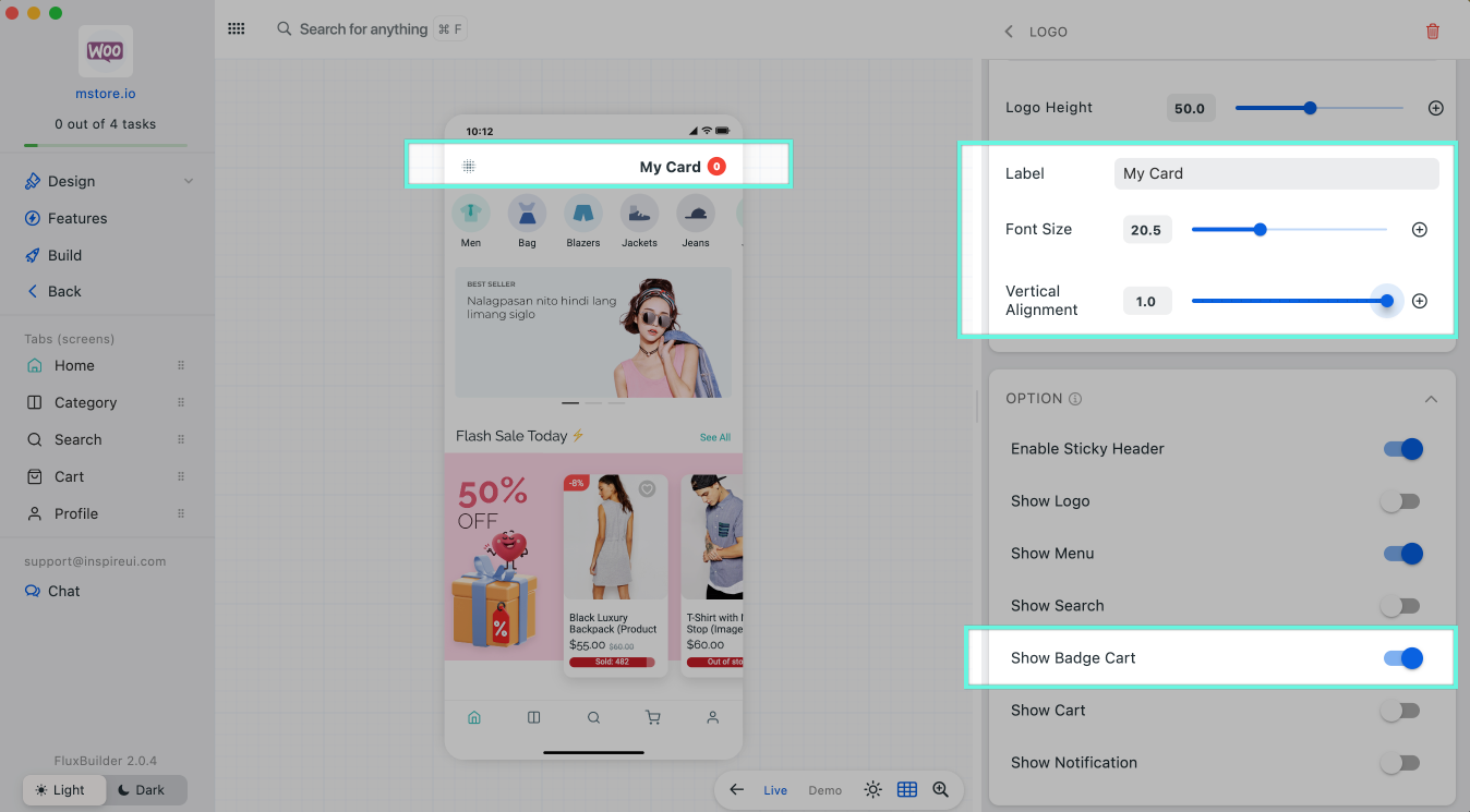
**Logo** supports Text config and Badge Cart
To set this new UI, please go to an app, select Home, edit/add a Logo
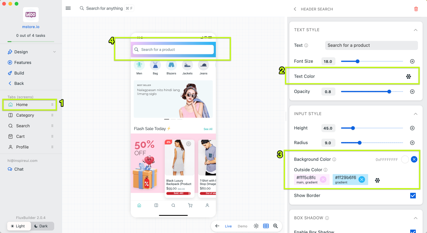
**Header Search** supports Gradient and Text Color
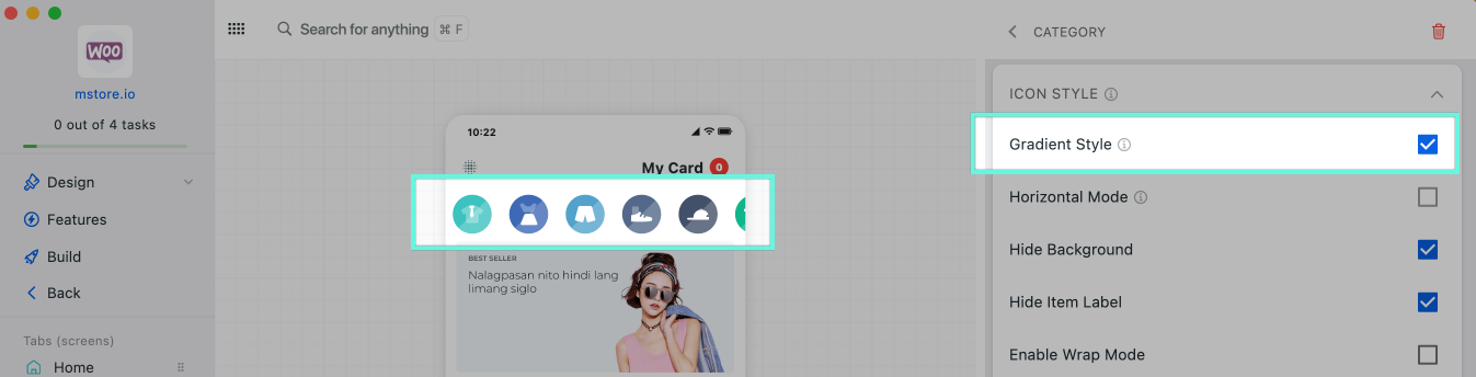
**Category (Icon)** with Gradient style
Select an app on FluxBuilder, select Home tab, edit/add a Category (Icon)
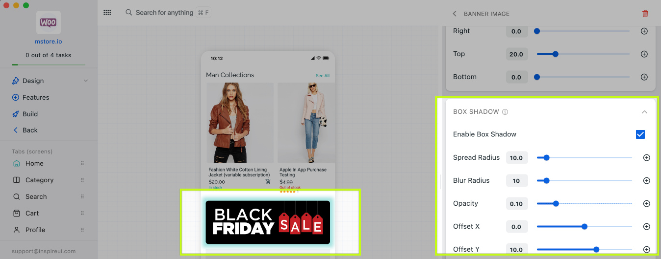
**Banner Image** with a shadow (Horizontal and Static types)
To set this new UI, please go to an app, select Home, edit/add a Banner Image, select Banner Type is STATIC or HORIZONTAL.
Product **flat** card
Horizontal Products and Vertical Layout can show products with Flat Card Design type. It looks elegant.
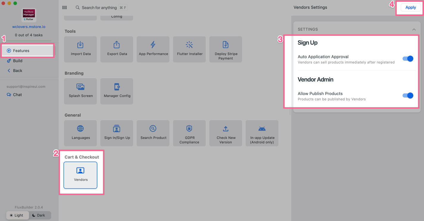
(9) Feature Upgrades
Auto-publish products in Manager App (Vendor app)
- Auto approval for Vendors after sign up.
- You easily configure products to be published automatically after vendors create, or request a review.
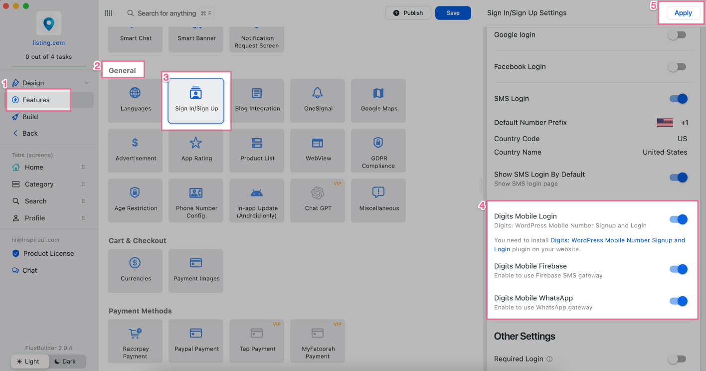
Digits Mobile Number Login via WhatsApp
- Supports users signing up and logging in with their Phone Number and One Time Passcode (OTP) on SMS. The feature also helps to avoid fake orders.
- Sending SMS via WhatsApp will save money 💸
- Available for WooCommerce, Listing, and WordPress apps.
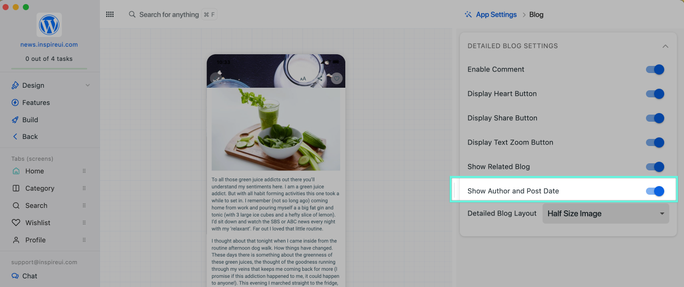
Author and Posting Date on **Blog post**
Show/hide Author and Posting Date on Blog posts. Select a blog post to view this configuration.
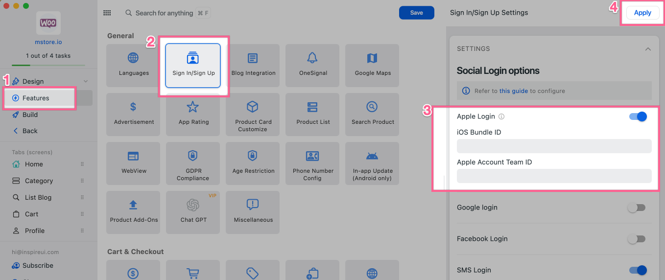
Apple Login
To successfully publish your app to the App Store, make sure to enable Apple Sign in if using Social Sign in.
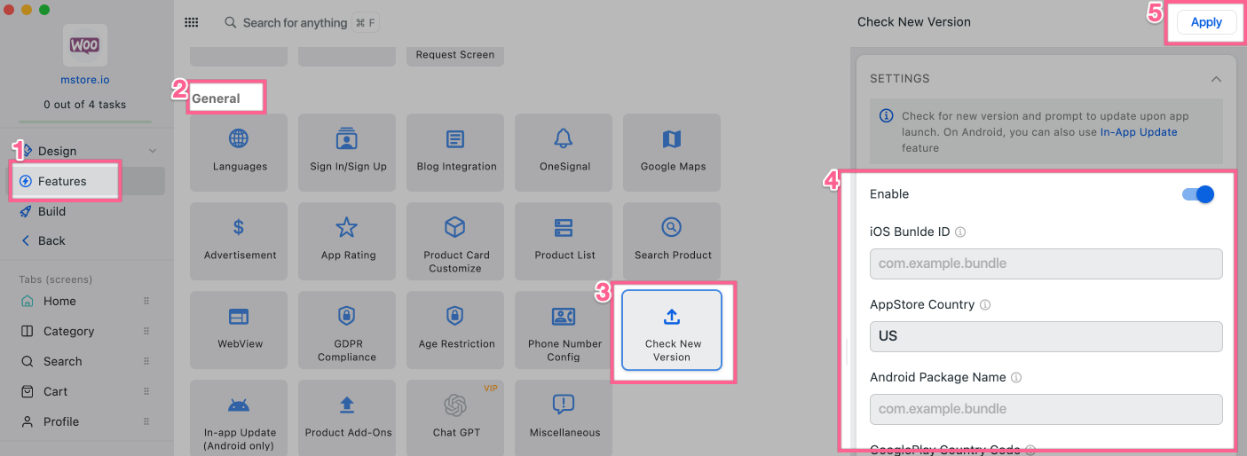
**Version Update Alert** for countries **outside US 📣**
When there is a new version, an alert is shown with a link to the appropriate App Stores page.
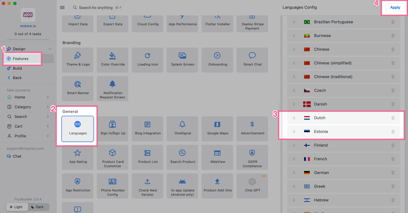
New **Estonia 🇪🇪** and **Danish** 🇩🇰 languages