Product Details
The Product Detail Screen provides a comprehensive view of the selected product. This instruction provides you with the necessary details and guidance to customize and optimize the Product Detail Screen with FluxBuilder.
Deliver and Manager apps do not support the following Product Detail configurations.
Video Guide
Manual Guide
Product Details screen or Blog Details screen are easy to edit by following steps:
Step 1: on FluxBuilder, open your app, then click Home.
Step 2: Select a product/blog on the simulator.
Step 3: edit as you like.
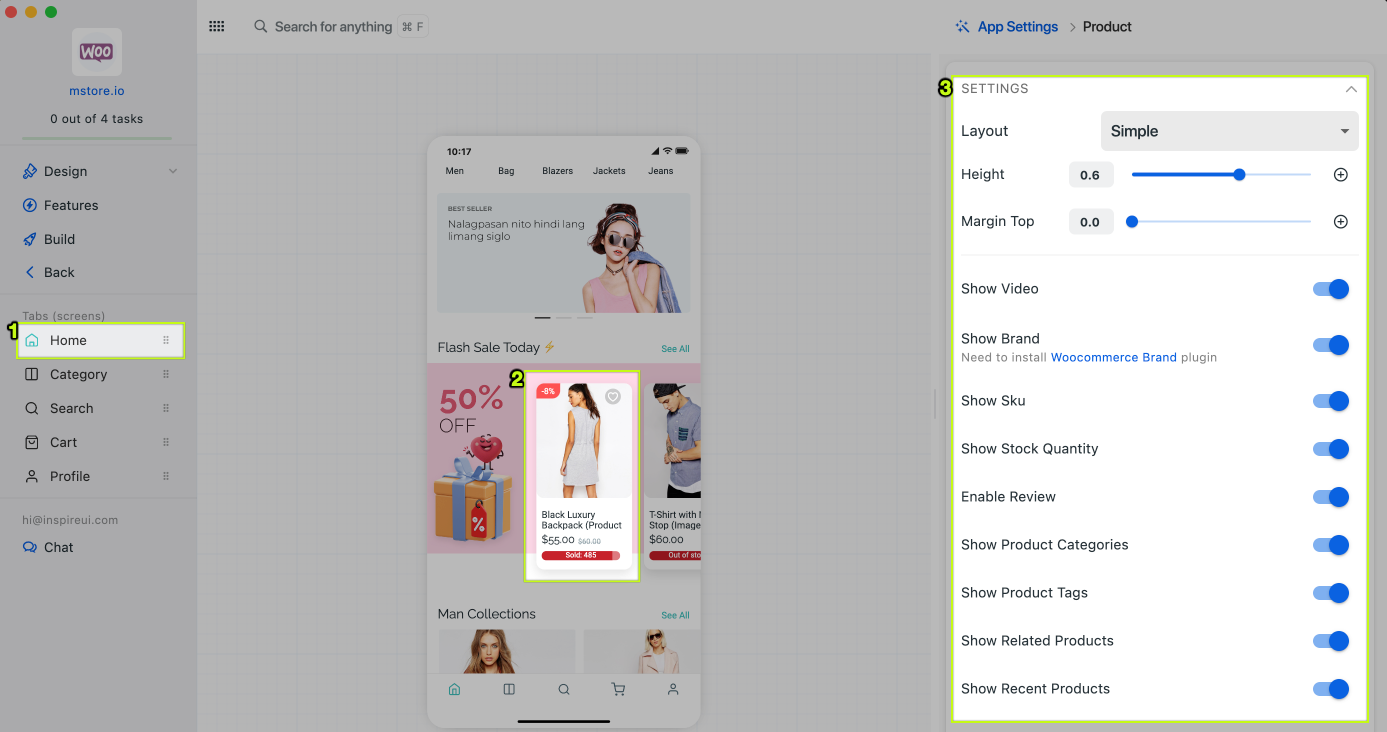
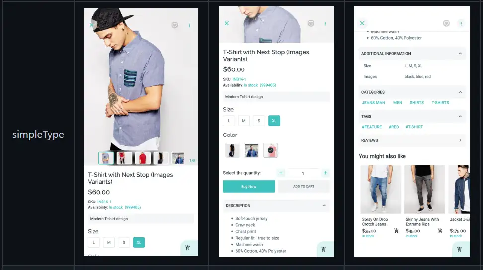
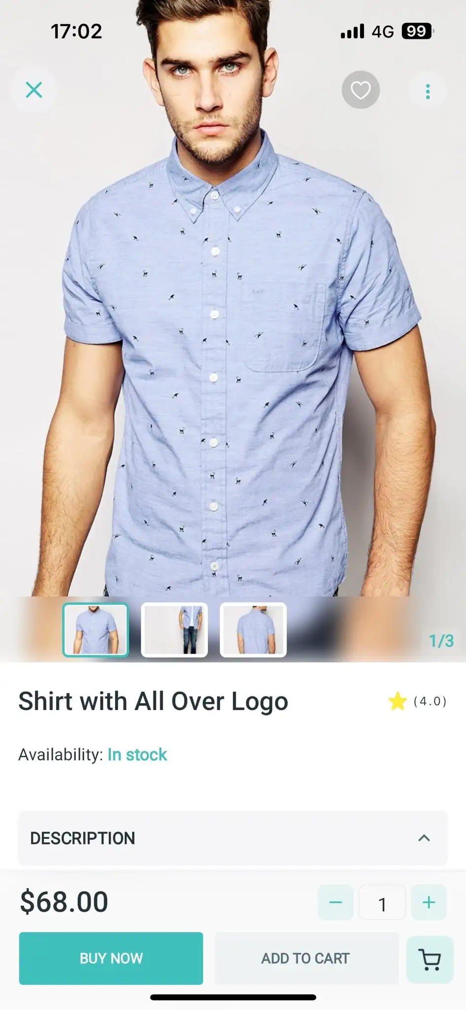
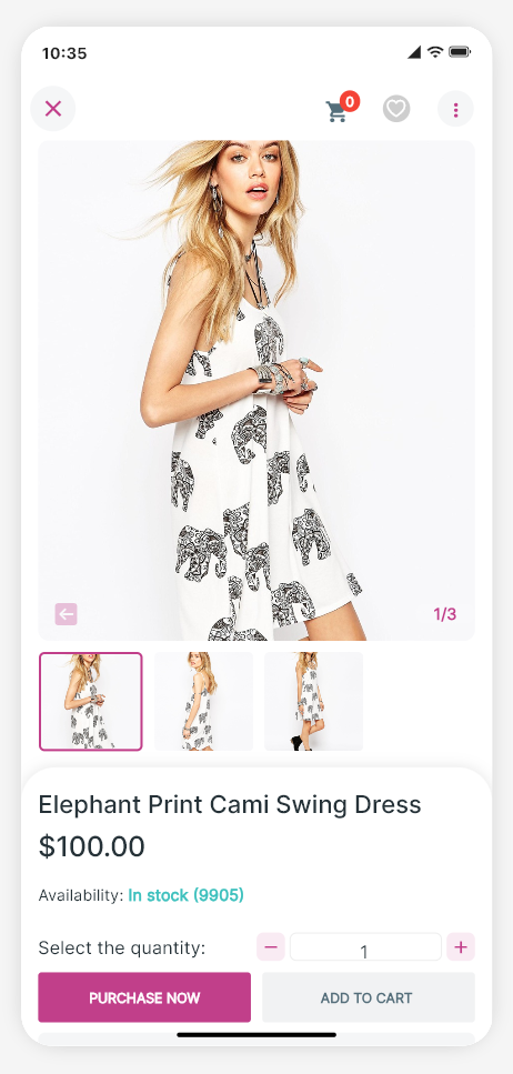
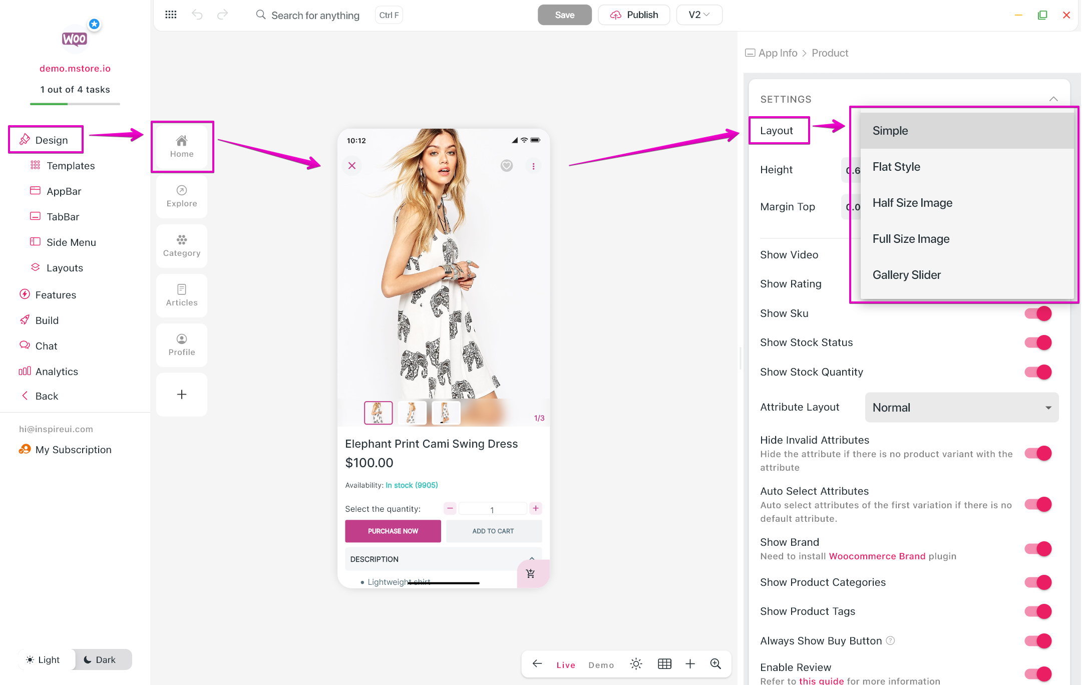
1. Layout
The Product Detail screen can display on the app under 4 types:
1.1 Simple Type
1.2 Half Size Image Type
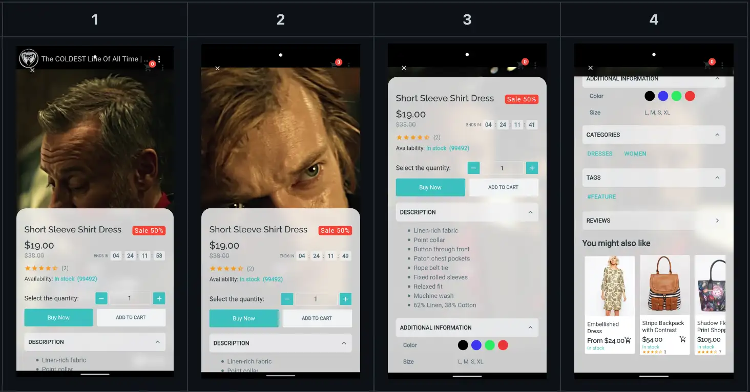
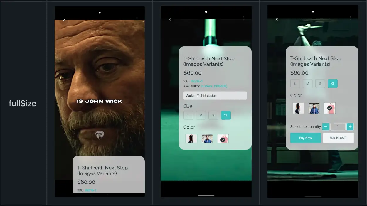
1.3 Full Size Image Type
1.4 FlatStyle
1.5 Gallery Slider
To change the Product Detail screen type:
- Step 1: open your app on FluxBuilder.
- Step 2: on the leftmenu, select the
Designitem. Then on the simulator, click on any product. - Step 3: select
Layoutand choose one of the 5 layouts.
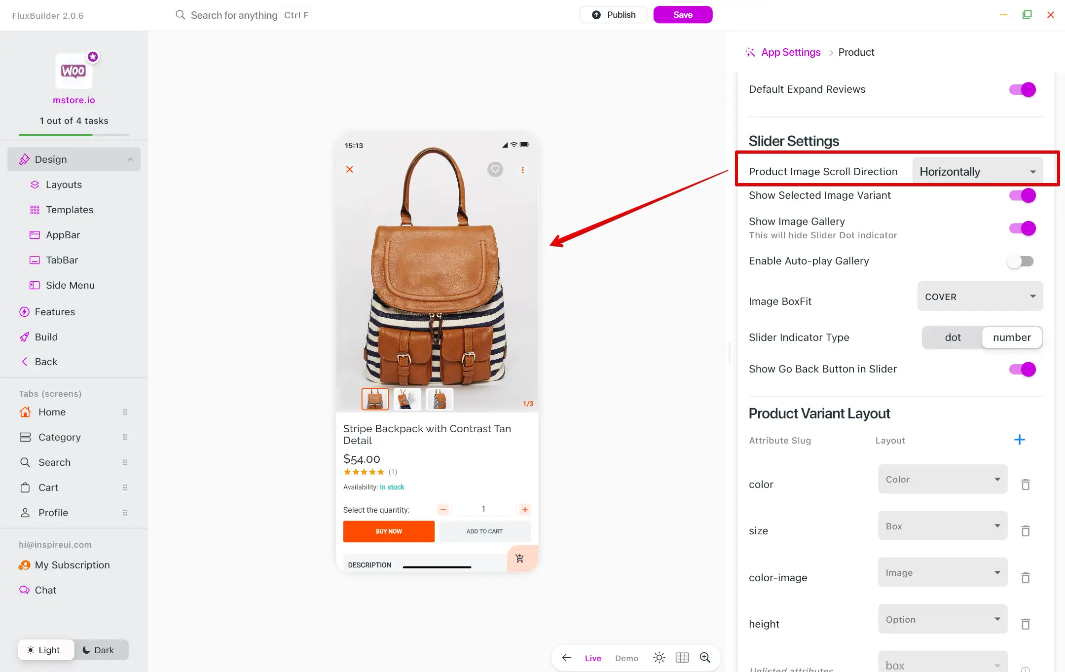
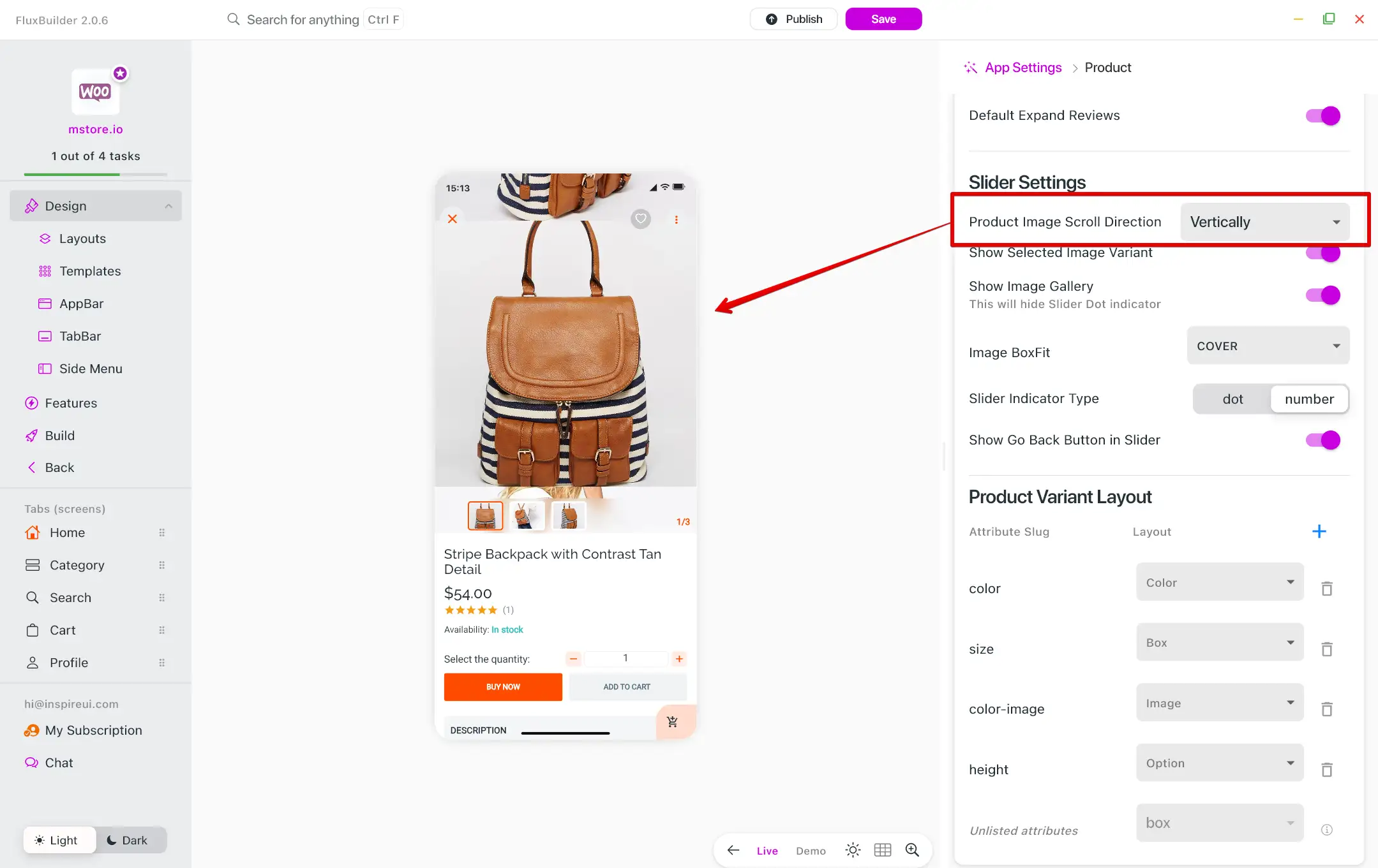
2. Vertical Product Gallery
In addition to the normal product gallery, the app presents the product image gallery in a vertical format, adding a unique touch to the user interface of the product detail page.
The feature is now available for Simple Type and Flat Style of Product Detail Themes.
Follow the guide below to setup the feature:
- Step 1: open your app on FluxBuilder.
- Step 2: on the leftmenu, select the
Designitem. Then on the simulator, click on any product. - Step 3: On the right panel, scroll to
Product Image Scroll Direction. Then SelectHorizontallyorVertically.
Horizontally:
Vertically:
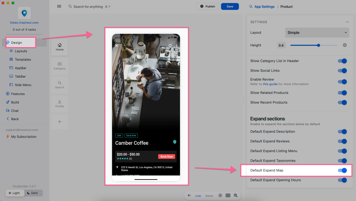
3. Map in Listing
After uploading a new listing, the Listing app support displaying the store on map on Listing Detail screen as the image:
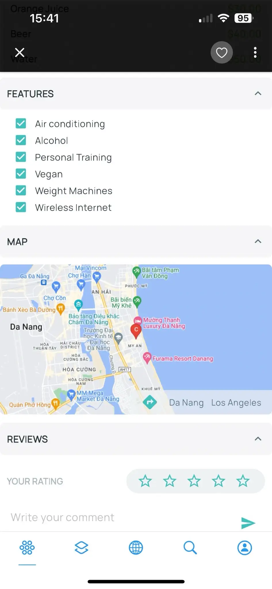
To configure, follow the steps below:
Step 1: open your app on FluxBuilder.
Step 2: on the leftmenu, select the
Featuresitem.Step 3: click the
General, then selectGoogle Mapand config the feature as this guide: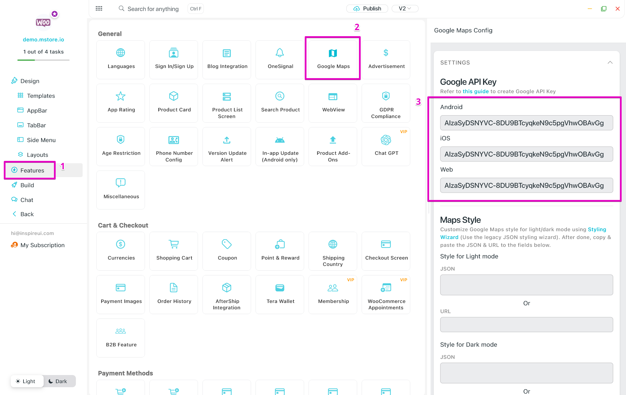
Step 4: On the simulator of FluxBuilder, click on any listing. Enable Default Expand Map.
4. Product Detail Slider
The slider settings for the Image Gallery on the Product Details screen are available for Simple Type and Flat Style.
Follow the steps below to configure:
Step 1: open your app on FluxBuilder.
Step 2: on the leftmenu, select the
Designitem. Then on the simulator, click on any product.Step 3: On the right paner, scroll down to find the
Slider Settings. There, you'll find the options to configure the settings to suit your specific needs.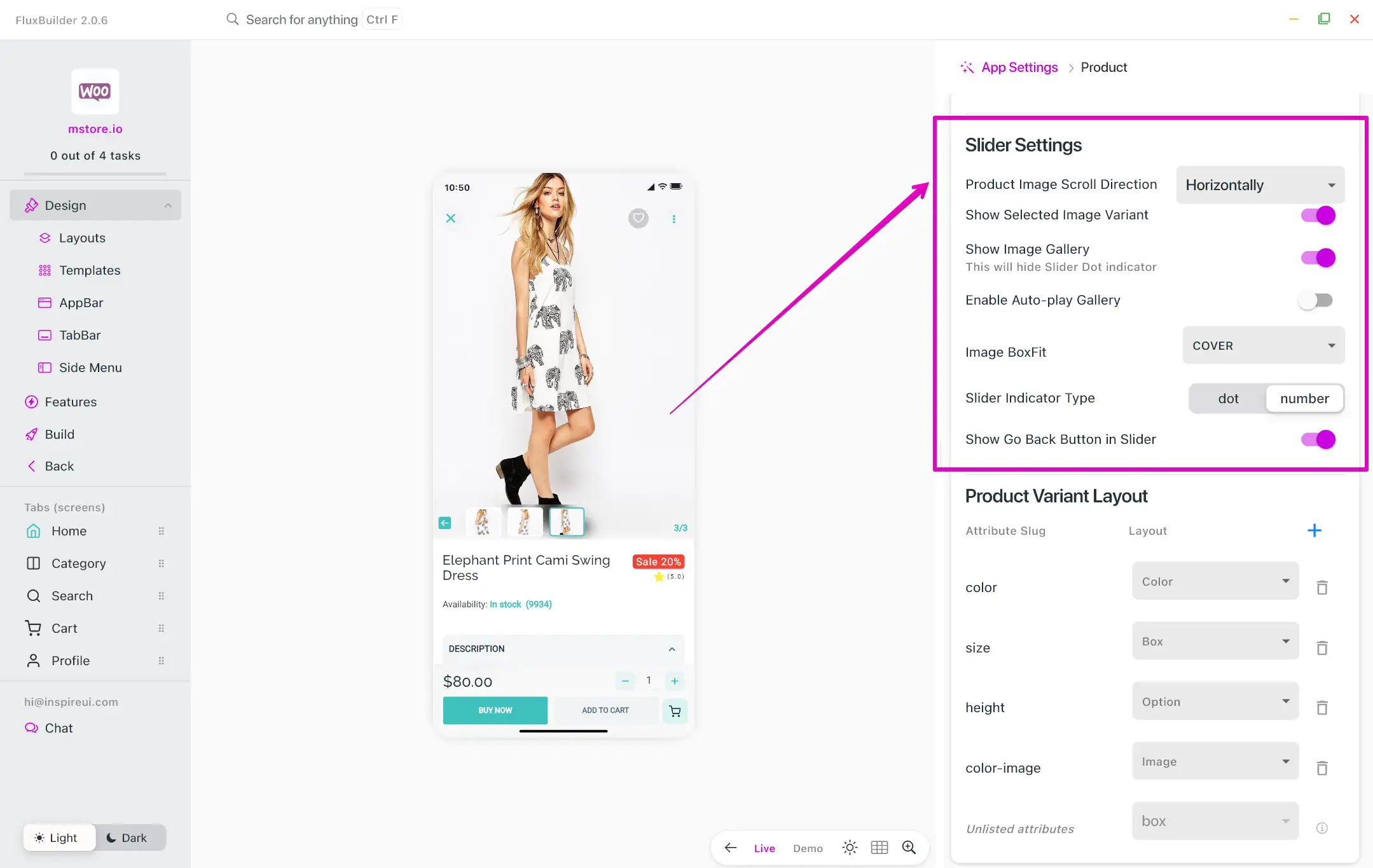
5. Product Variation Layouts
Variable products (or variant products) are supported in all apps on FluxBuilder. Variable products display like this:

To show the variant products on the app successfully, make sure to:
Complete the website integration (install all the required plugins if any).
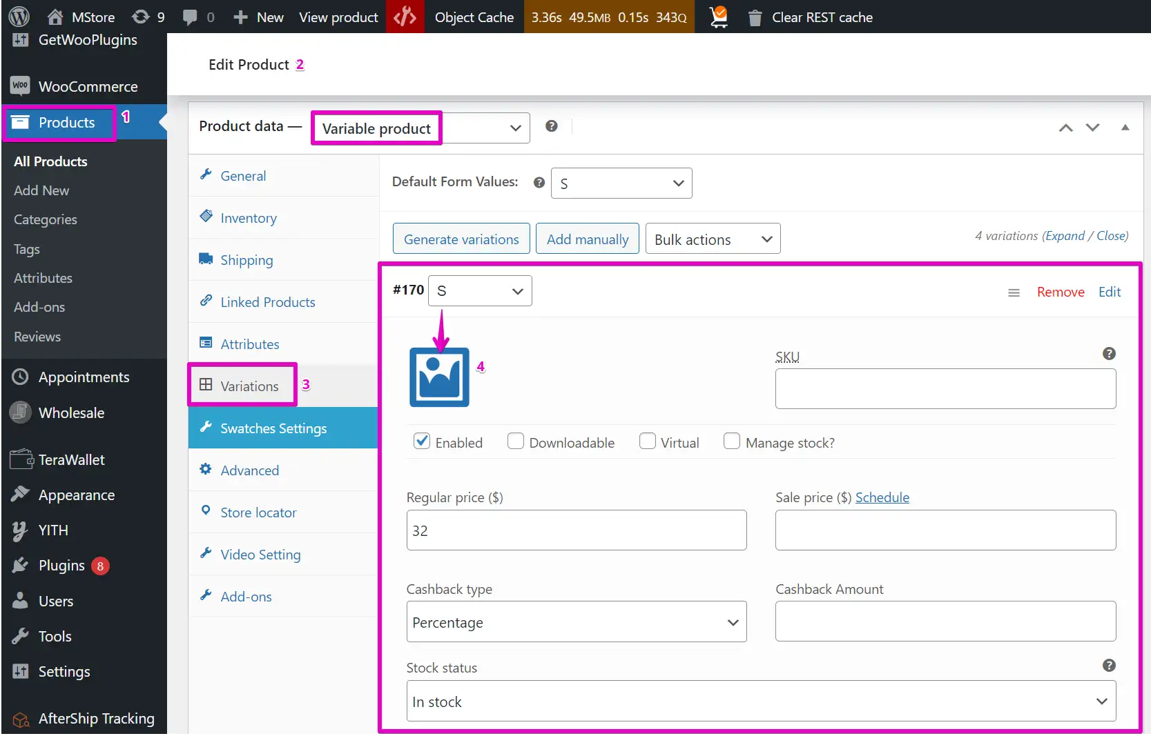
Add Variable products on your website. Set
AttributesandVariationsfor the products.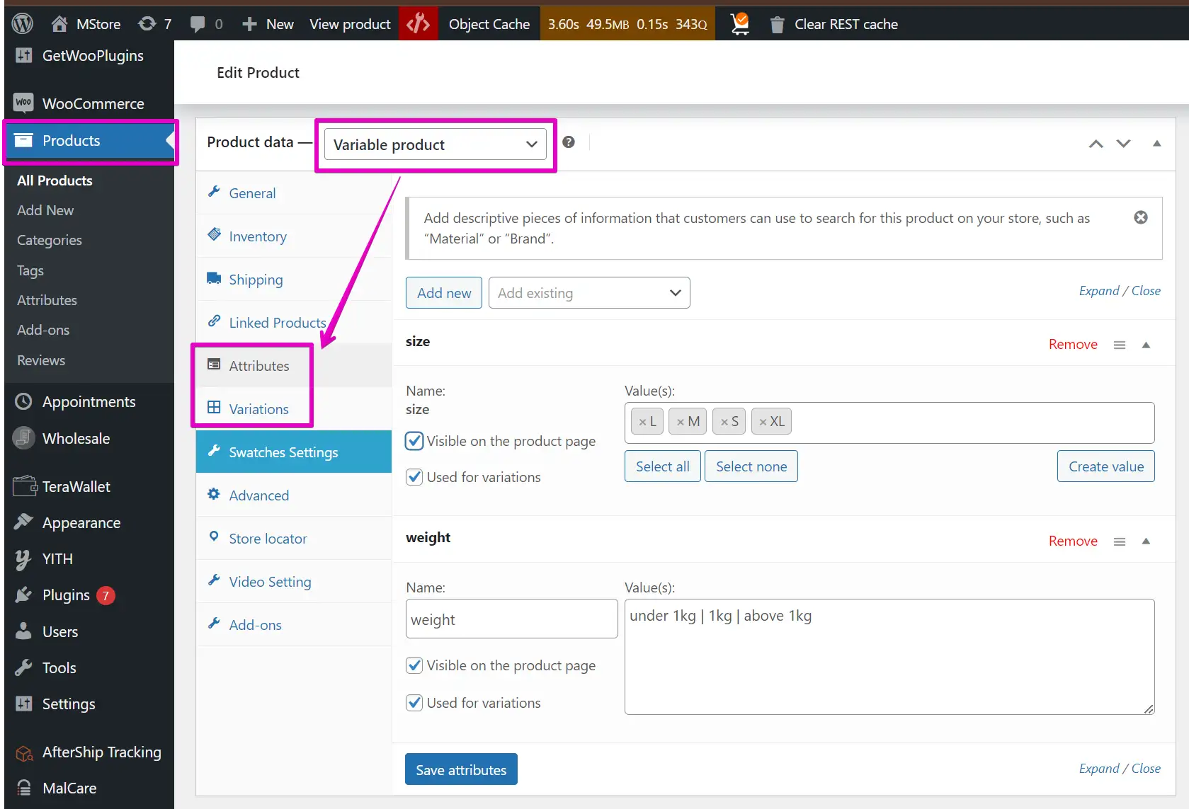
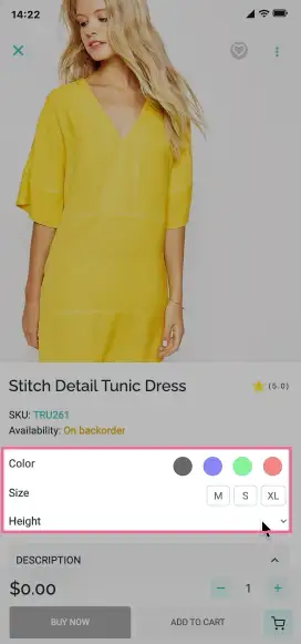
You can choose the default selected values for attributes as below. These values will be automatically selected when users visit the Product Detail screen.
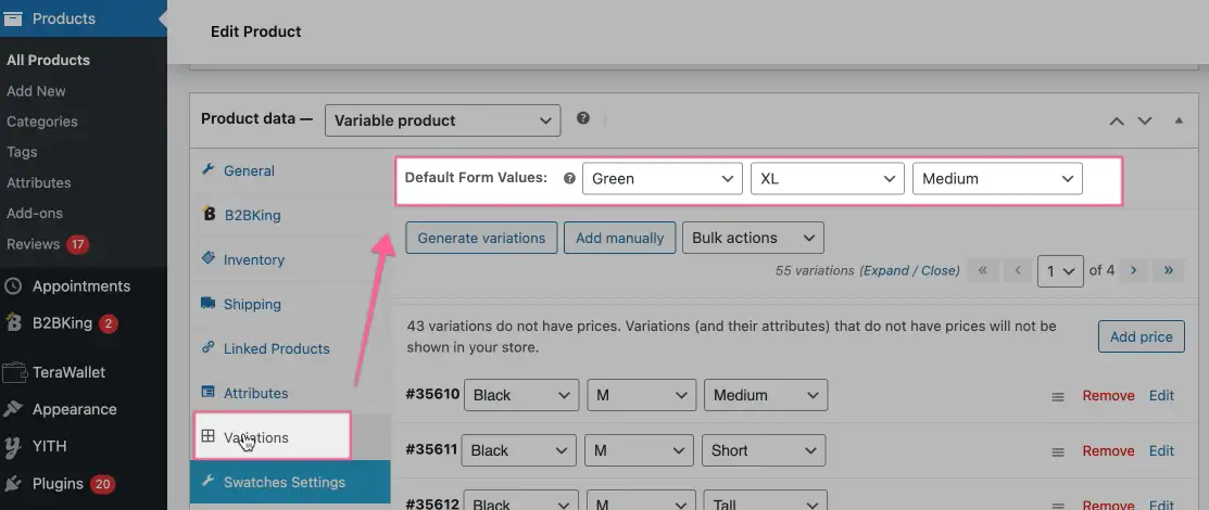
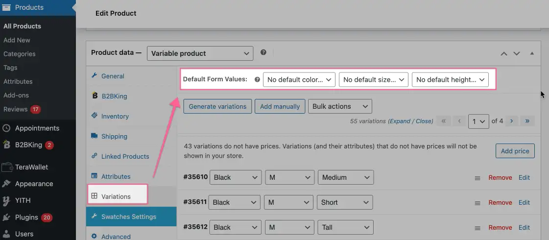
If you do not choose the selected default values in the website admin as this image:
Then For WooCommerce, MultiVendor (WCFM, Dokan), and Notion apps, there will be two types as follows:
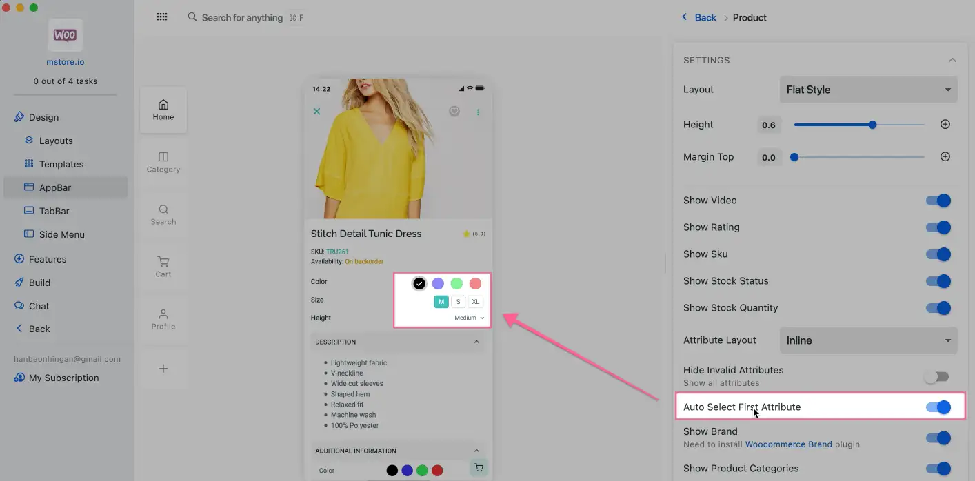
- If you want automatically select the first values of attributes when the product is opened on the app, on FluxBuilder: open your app, then select a product, and turn on
Auto Select First Attribute:
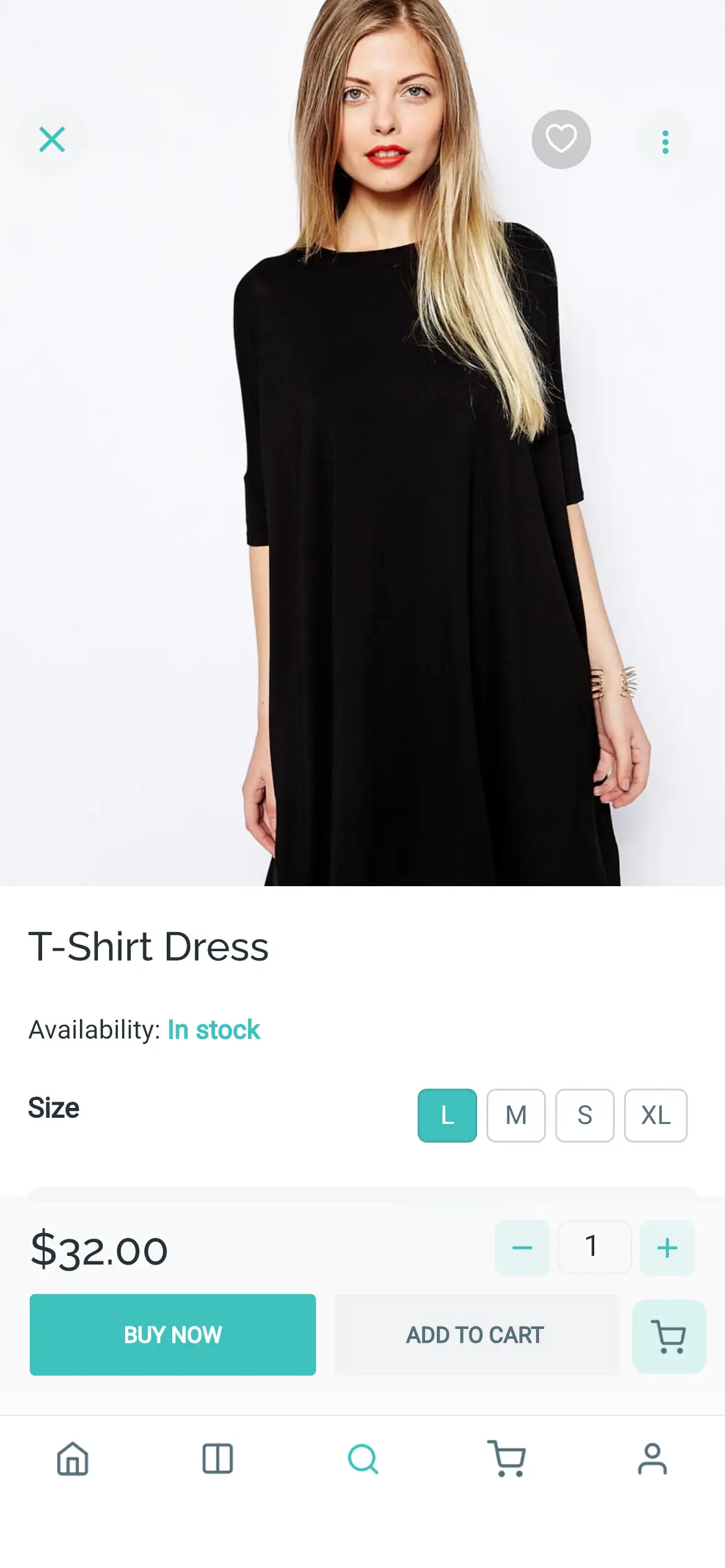
- Else, if you do not want any default select value when opening the Product Detail screen, turn off "Auto Select First Attribute", and it will display like this:
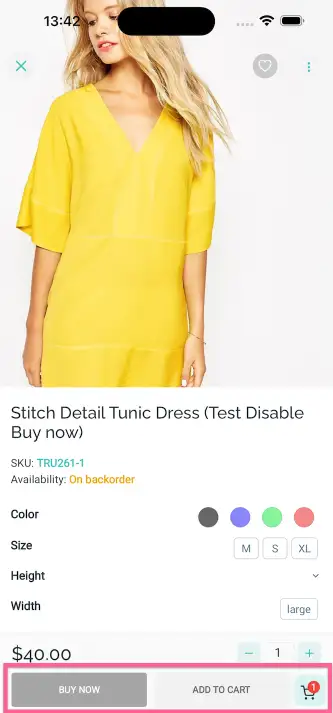
Disable Buy Now button for Invalid Attributes
When clicking on a invalid attribute on the variation product, instead of displaying Unavailable button, the Buy Now button still displays, but it will be disabled:
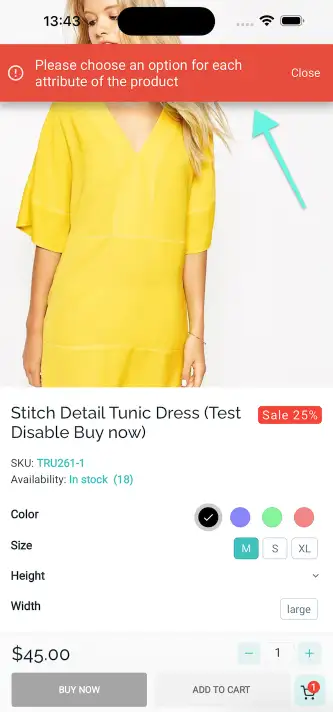
If customers do not select any attribute or select invalid attributes, and then click the Add To Cart or Buy Now buttons, it will show a popup as a reminder.
To do that, follow steps:
- Step 1: open your app on FluxBuilder.
- Step 2: on the leftmenu, select the
Designitem. Then on the simulator, click on any product. - Step 3: On the right paner, enable
Show Buy Now button.
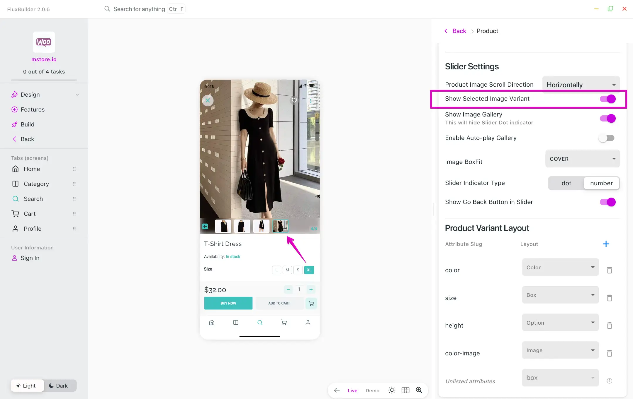
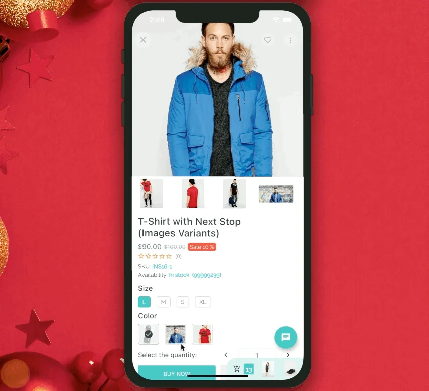
Show Image for Selected Variant
To enable the automatic display of corresponding images when selecting a product variation on your app, please follow the steps:
Step 1: Set images for the variations of a product, for example:
Step 2: Configure the app to display the image for the selected variation.
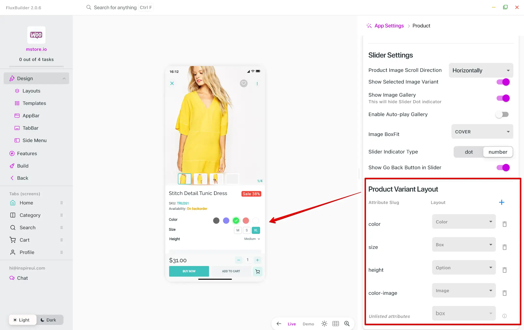
6. Dynamic Product Variant
With this feature, the product variation options fields are transformed into visually appealing representations such as color, box, and option layouts. It is currently compatible with all apps.
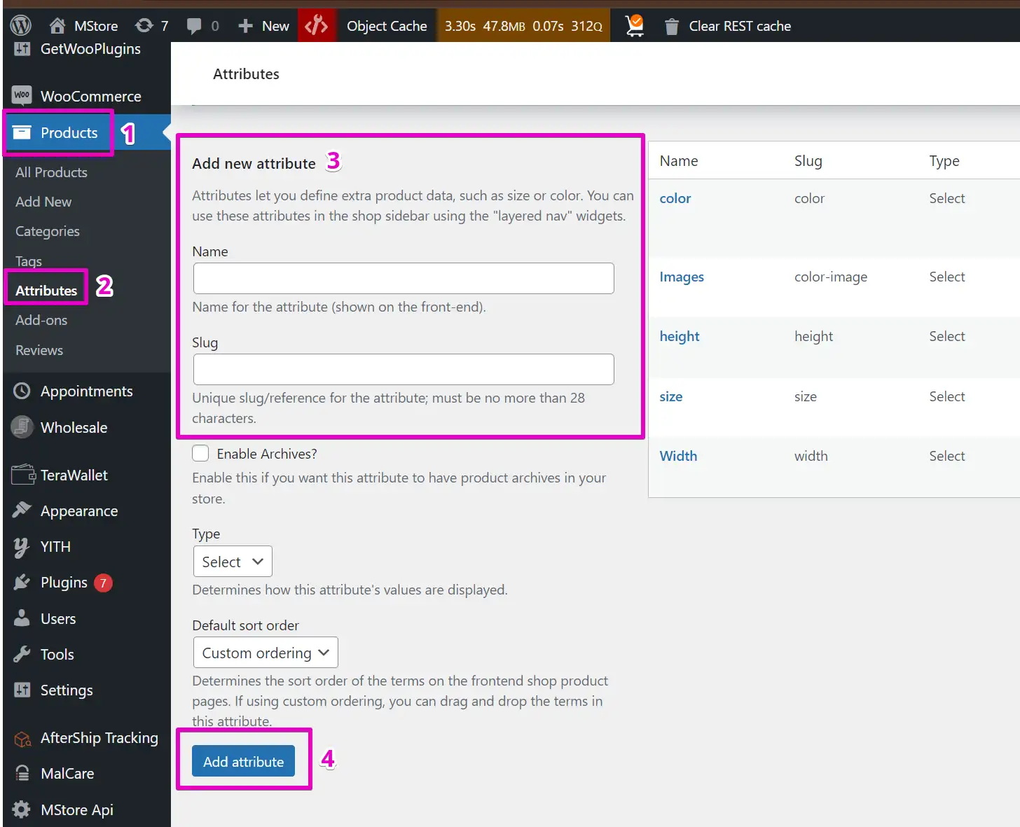
Before setting the Product Variant layouts, you need to set up the Attributes of Products as the image.
Then, follow the steps below to change the layout in FluxBuilder:
Step 1: Open your app.
Step 2: Select any product on the simulator.
Step 3: On the right side screen, scroll down to find the Product Variant Layout.
Step 4: Click + to add new Attribute Slug.
Step 5: Select Layout for the attribute.
Attribute Layout
Currently, our apps support 2 layouts to display attributes:
- Attribute Layout is Normal
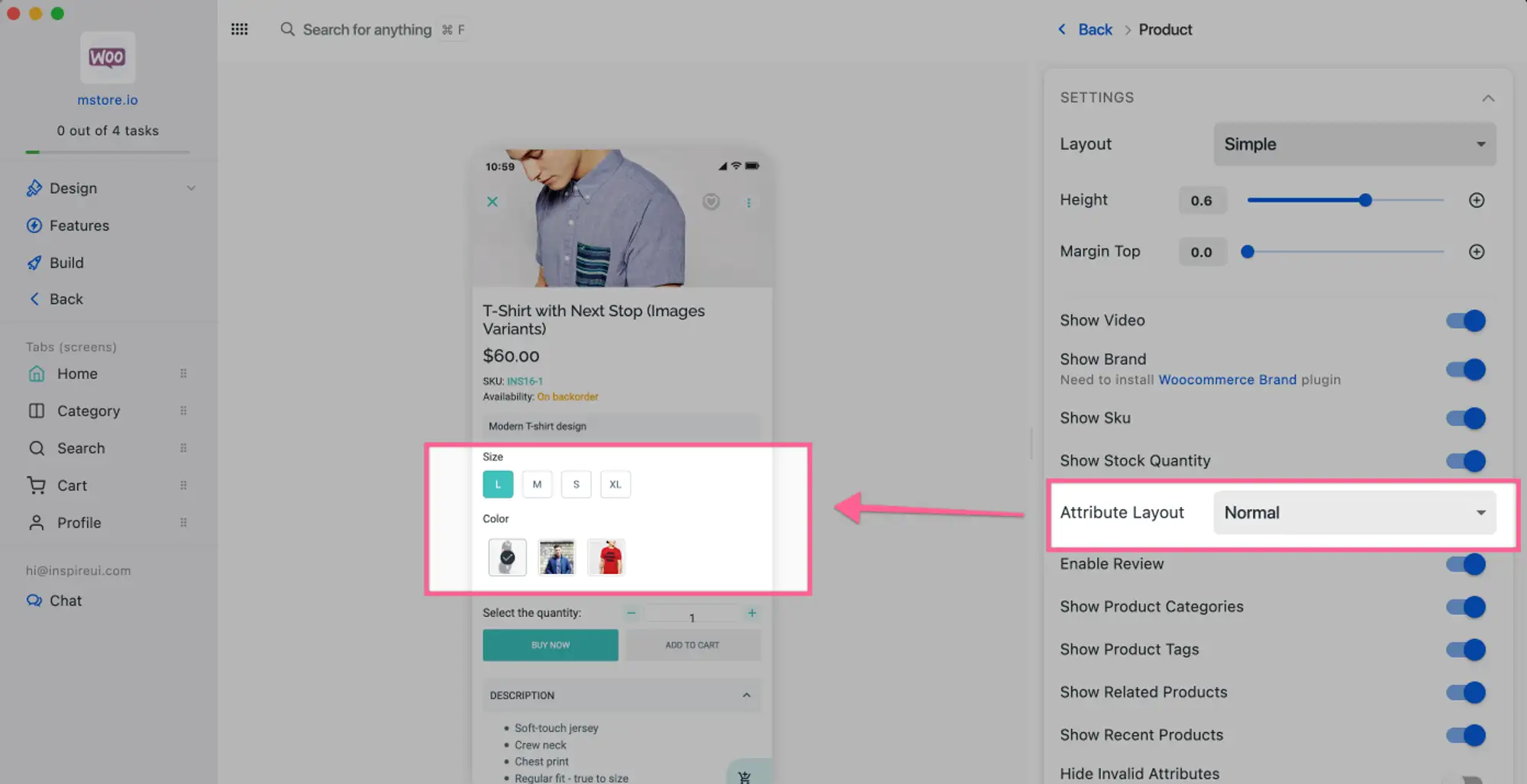
- Attribute Layout is Inline
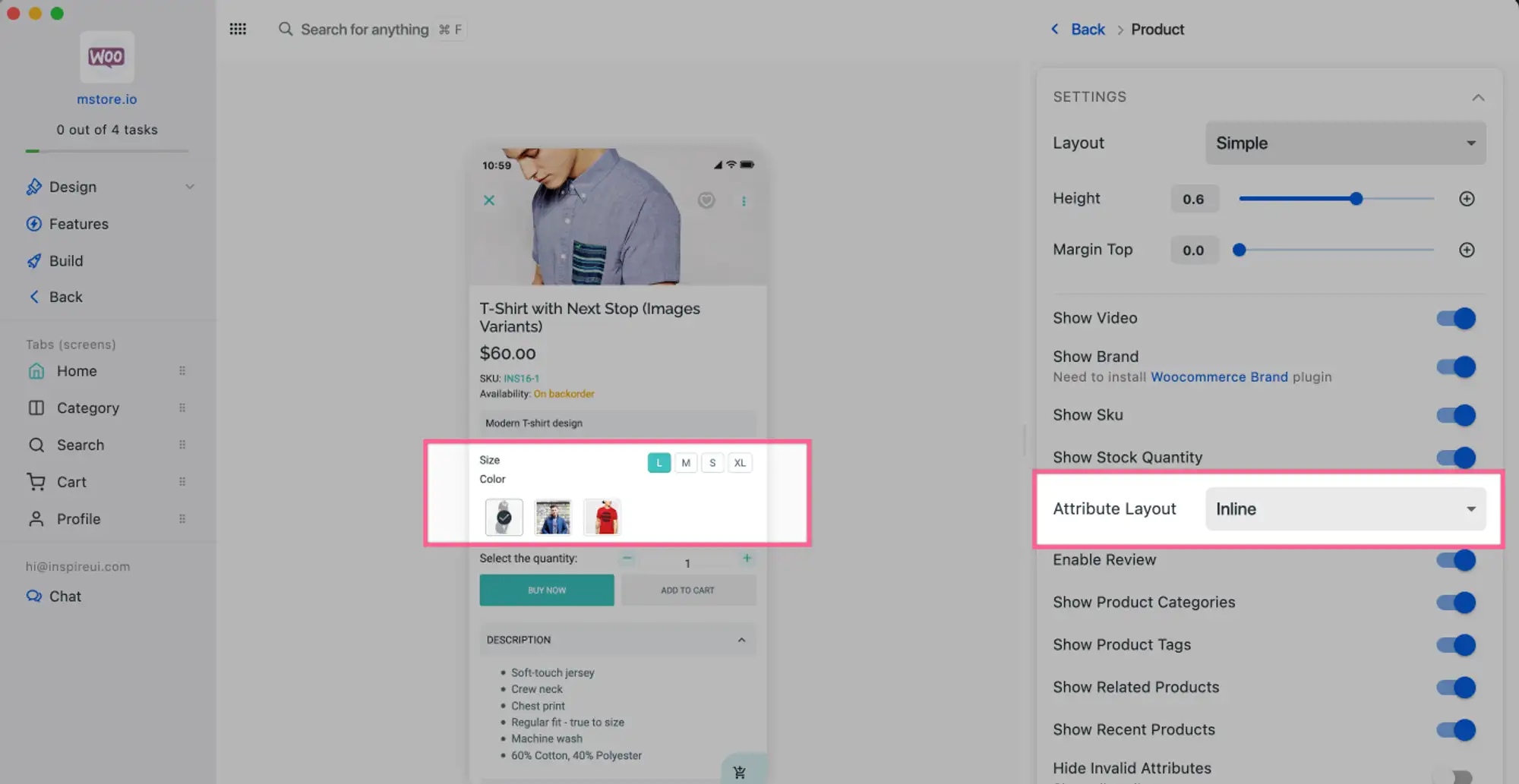
Follow the steps below to configure in FluxBuilder:
Step 1: Open your app.
Step 2: Select any product on the simulator.
Step 3: On the right side screen, find the Attribute Layout and select the suitable layout.
7. Variation Swatches
The Variation Swatches plugin turns the product variation select options fields into radio images, colors, and labels. Helps you show product variation items in images, colors, and labels. It also enables them in product quick view.
Besides creating size, brand, image, color, and label variation swatches, you can handle the swatches shape style Rounded and Circle.
It is available for WooCommerce, and Multi Vendors app. Compatible with this https://wordpress.org/plugins/woo-variation-swatches plugin.
Follow these steps to set up variation swatches on app:
Step 1: Open Website admin, open Products and select Attributes
Step 2: Add new Attribute with Image Type
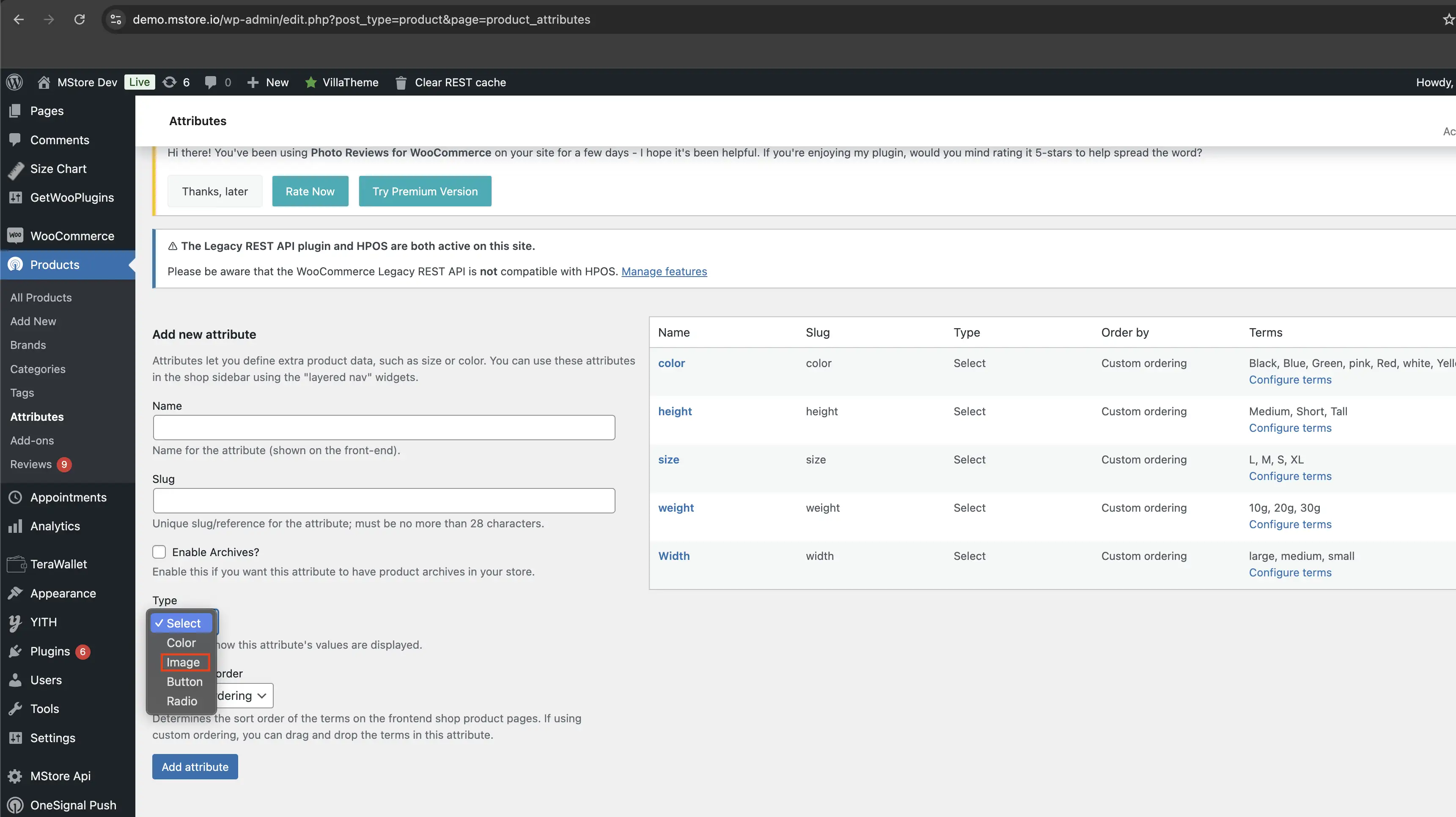
Step 3: Click Configure terms to add items for the new attribute
Step 4: Re-open Products, then open the Variable product needing variation swatches
Step 5: In Attributes, select the created attribute and Save attributes
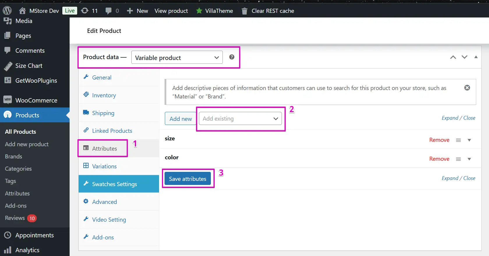
Step 6: Go to Variations, and add more variations
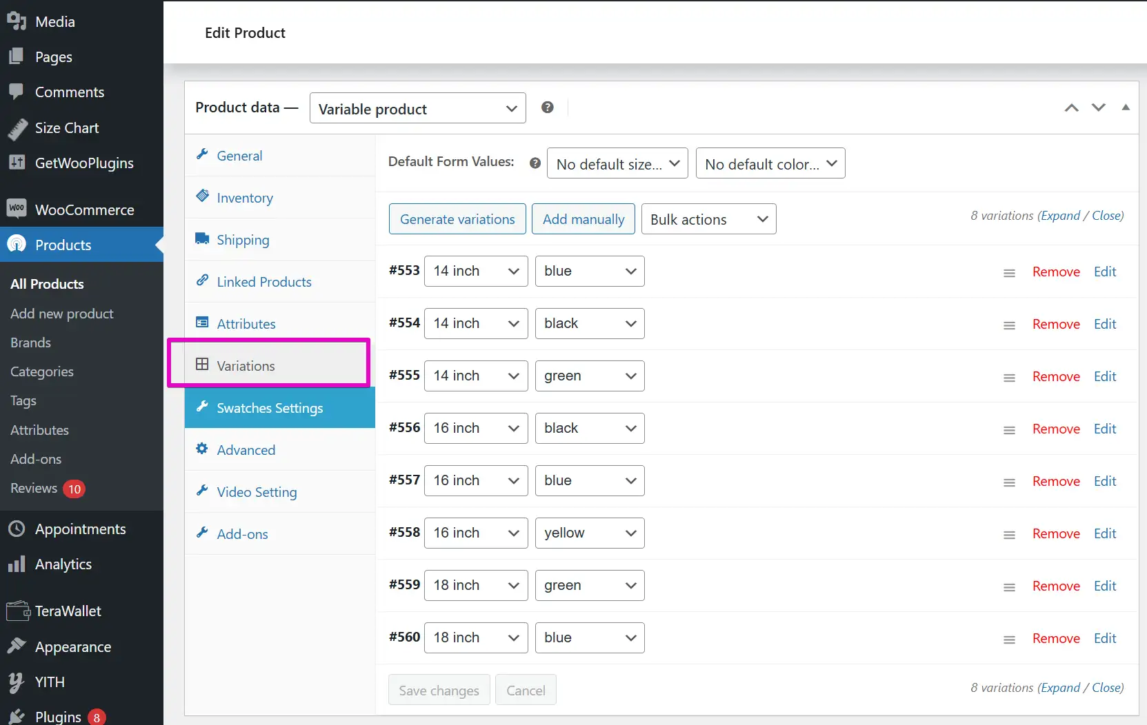
Now, the app will update automatically to show the image variations for the product.
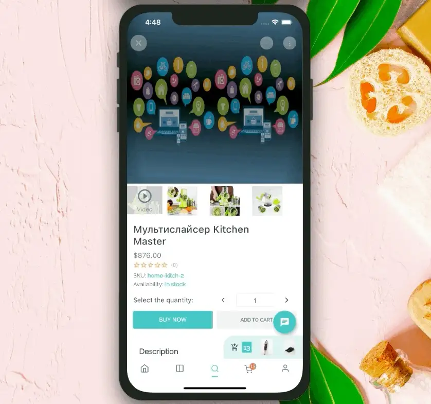
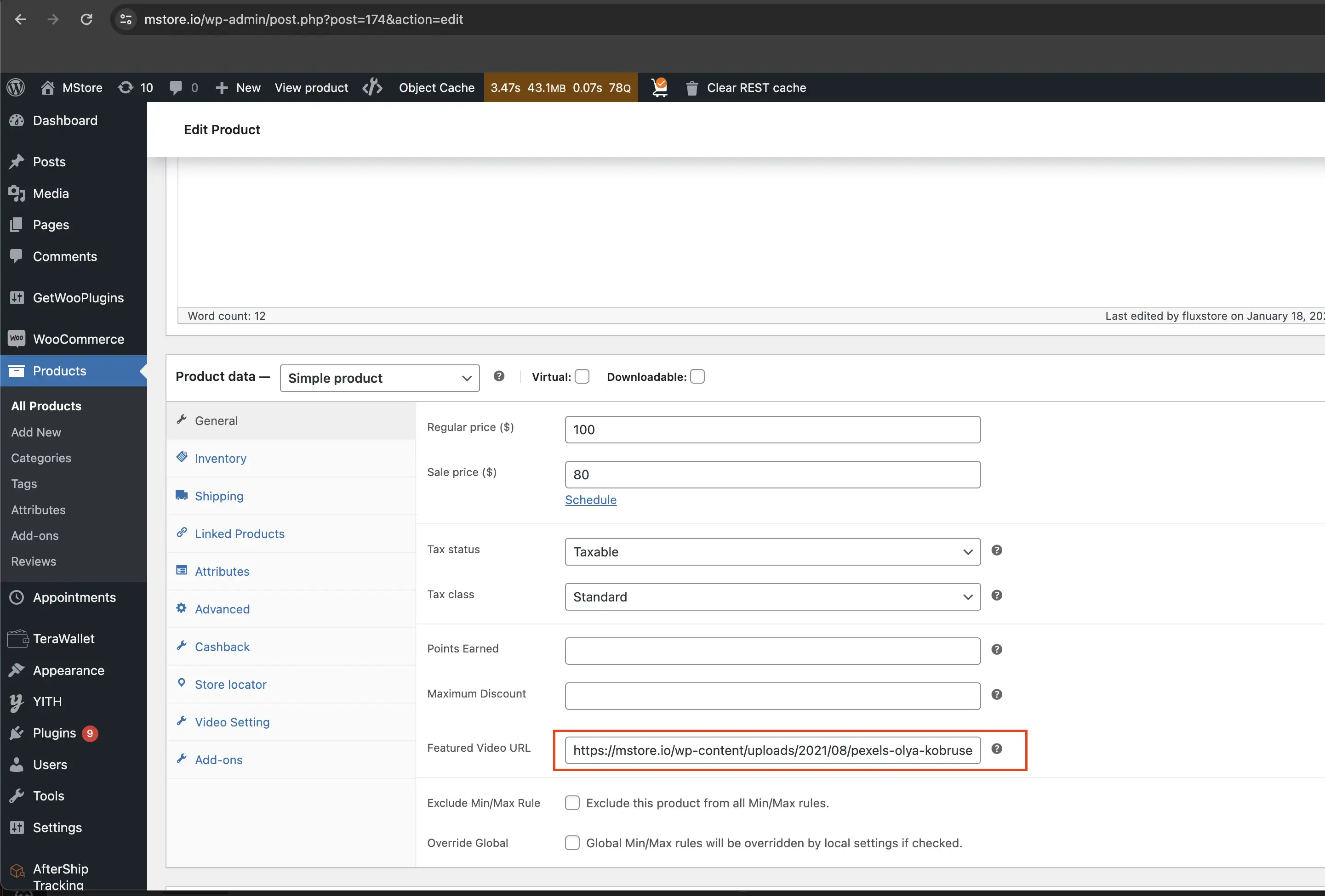
8. Inline Video
Allow your users to see a YouTube or Vimeo video instead of the featured image of the Product Detail page.
You can use WooCommerce Featured Video or YITH WooCommerce Featured Video plugins.
This feature is available for Woocommerce app or Multi Vendors app.
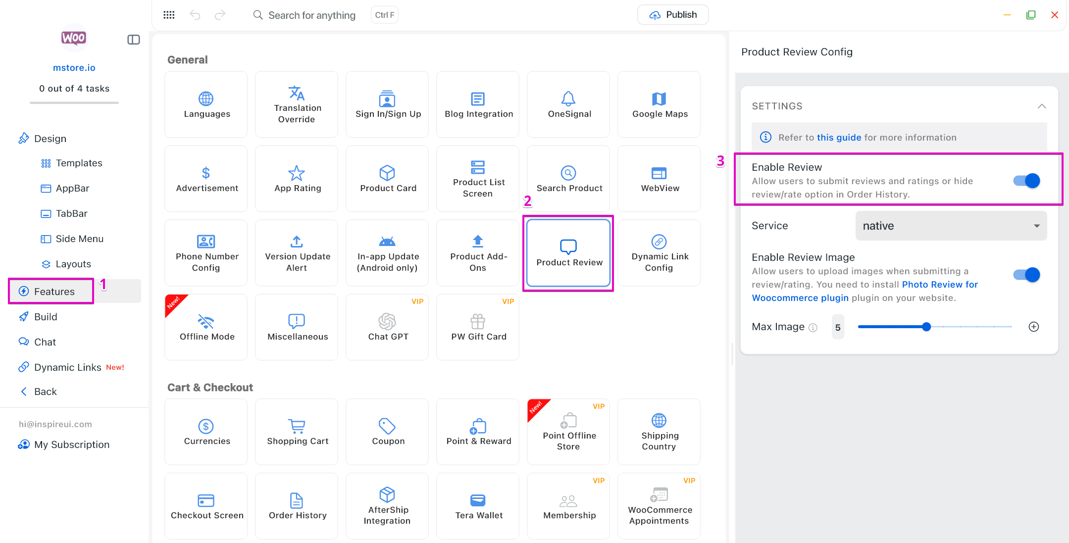
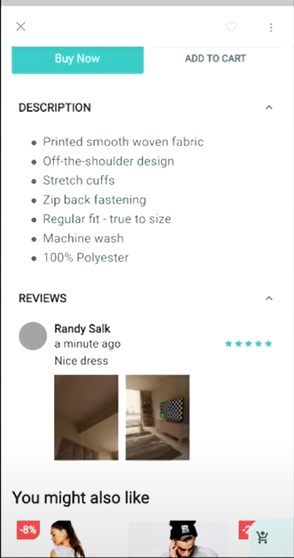
9. Rating and Reviews
By reading reviews, customers can benefit from the firsthand experiences of others, gaining confidence in their purchasing choices. These apps - Woocommerce, Multi Vendors, Shopify and Listing - support rating and review presentations on the Product Details screen.
Use FluxBuilder to enable the feature as below:
💠 For Woocommerce and Multi Vendors apps
Step 1: Open your app.
Step 2: Navigate to the Features on Side Menu. In General, open Product Review.
Step 3: Turn on Enable Review.
💠 For Shopify app
Follow the detailed guide here.
💠 For Listing app
Step 1: Open your app.
Step 2: Navigate to the Features on Side Menu. In General, open Product Review.
Step 3: Turn on Enable Review.
Step 4: Open Design on the Side Menu.
Step 2: Select any listing on the simulator.
Step 6: On the right side screen, turn on Enable Review.
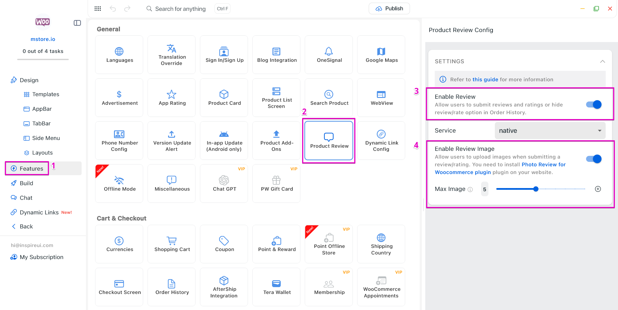
Photo Review
The Product Details screen also supports review photo presentations.
This feature is available for WooCommerce, Multi Vendors apps after installing this plugin on the website: https://wordpress.org/plugins/woo-photo-reviews/
To allow the display of review photos on the Product Details screen, follow the steps below:
Step 1: Open your app.
Step 2: Navigate to the Features on Side Menu. In General, open Product Review.
Step 3: Turn on Enable Review.
Step 4: Turn on Enable Review Image. Set the Max Image (the amount of image can be uploaded in the submitted review).
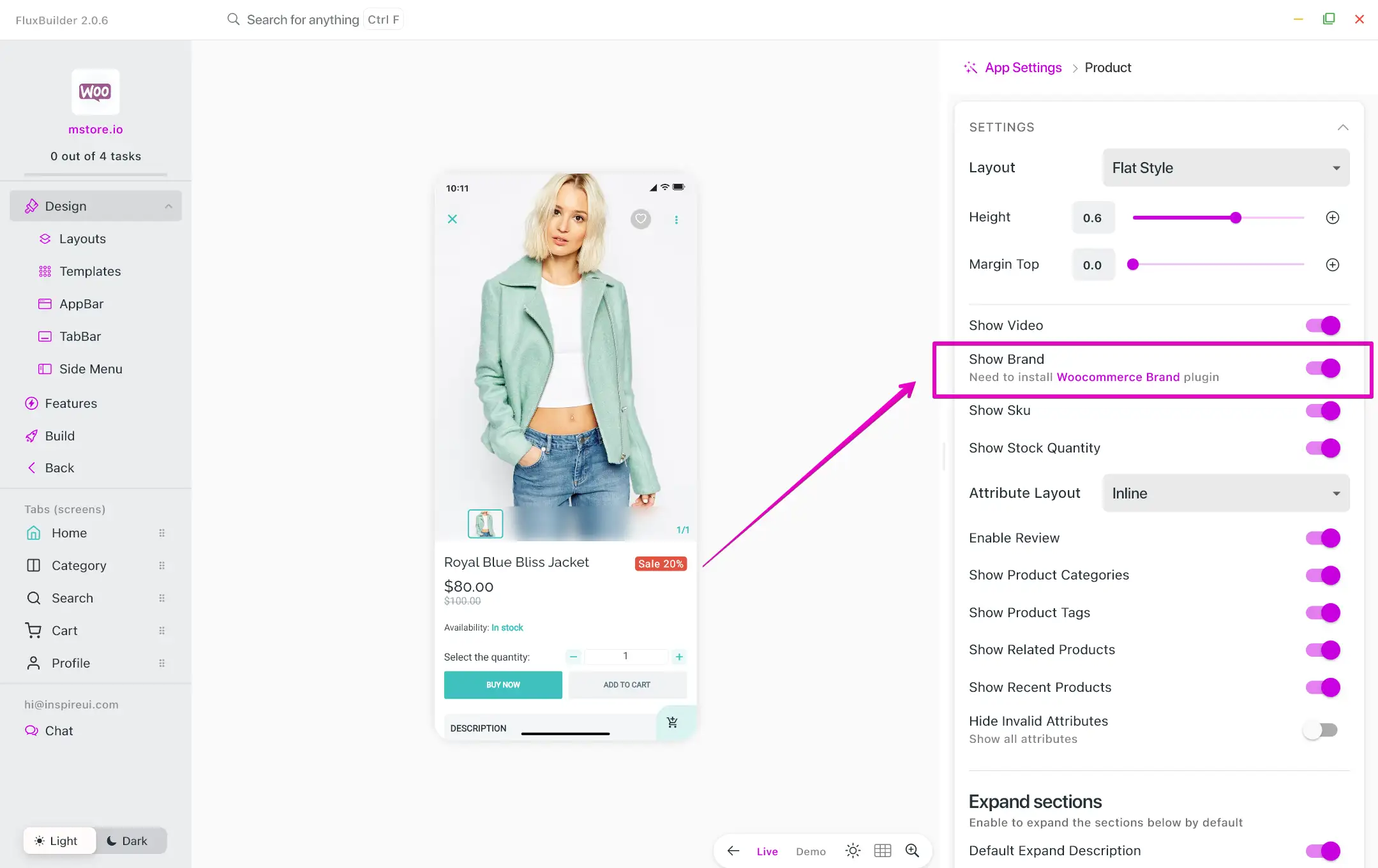
10. Brand Image
Woocommerce and Multi Vendors allow the app to display Brand Image of products on Product Details screen.
With the latest version of Woocommerce, you can directly use FluxBuilder to show Brand Image as below:
Step 1: Open your app.
Step 2: Select any product on the simulator.
Step 3: On the right side screen, turn on Show Brand option.
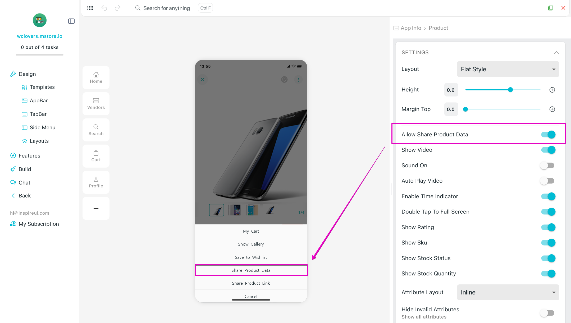
11. Share Product Data
The feature allows to share product’s images and description.
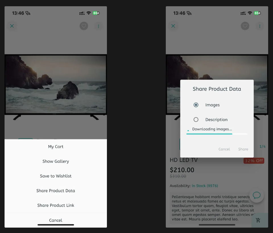
- Open app on FluxBuilder.
- On simulator, click on any product.
- Enable the option Allow Share Product Data.
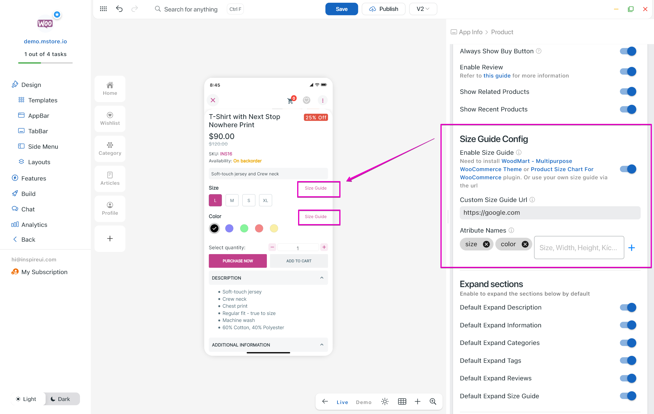
12. Size Guide Button
1. Plugin Size Guide Button
Ability to show the size guide/size chart on the Product Detail screen with the Product Size Chart For WooCommerce plugin:
- Should use an image instead of an HTML table to show the guide chart because the app cannot load CSS from a website and apply it to show on the app.
- Require MStore API 4.14.0 or later.
- Support theme.
- Available for Woocommerce, Multi Vendors.
The Size Guide will then be enabled on Product Details screen by following these steps:
- Open Woocommerce/ Multi Vendors app on FluxBuilder.
- On simulator, click on a product.
- In Size Guide Config, turn on Enable Size Guide.
- Input the Attribute Names that will display the Size Guide button.
Note: When a product fails to fetch the size guide html from the API, it will display a button and open webview with the Custom Size Guide URL that user adds to.
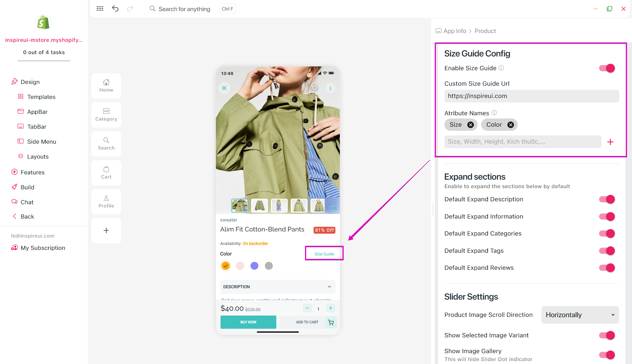
2. URL Size Guide Button
For all apps, the Size Guide button works through Size Guide URL (which means plugin is not required).
- Open your app on FluxBuilder.
- On simulator, click on a product.
- In Size Guide Config, turn on Enable Size Guide.
- Input Custom Size Guide URL.
- Add the Attribute Names that will display the Size Guide button.
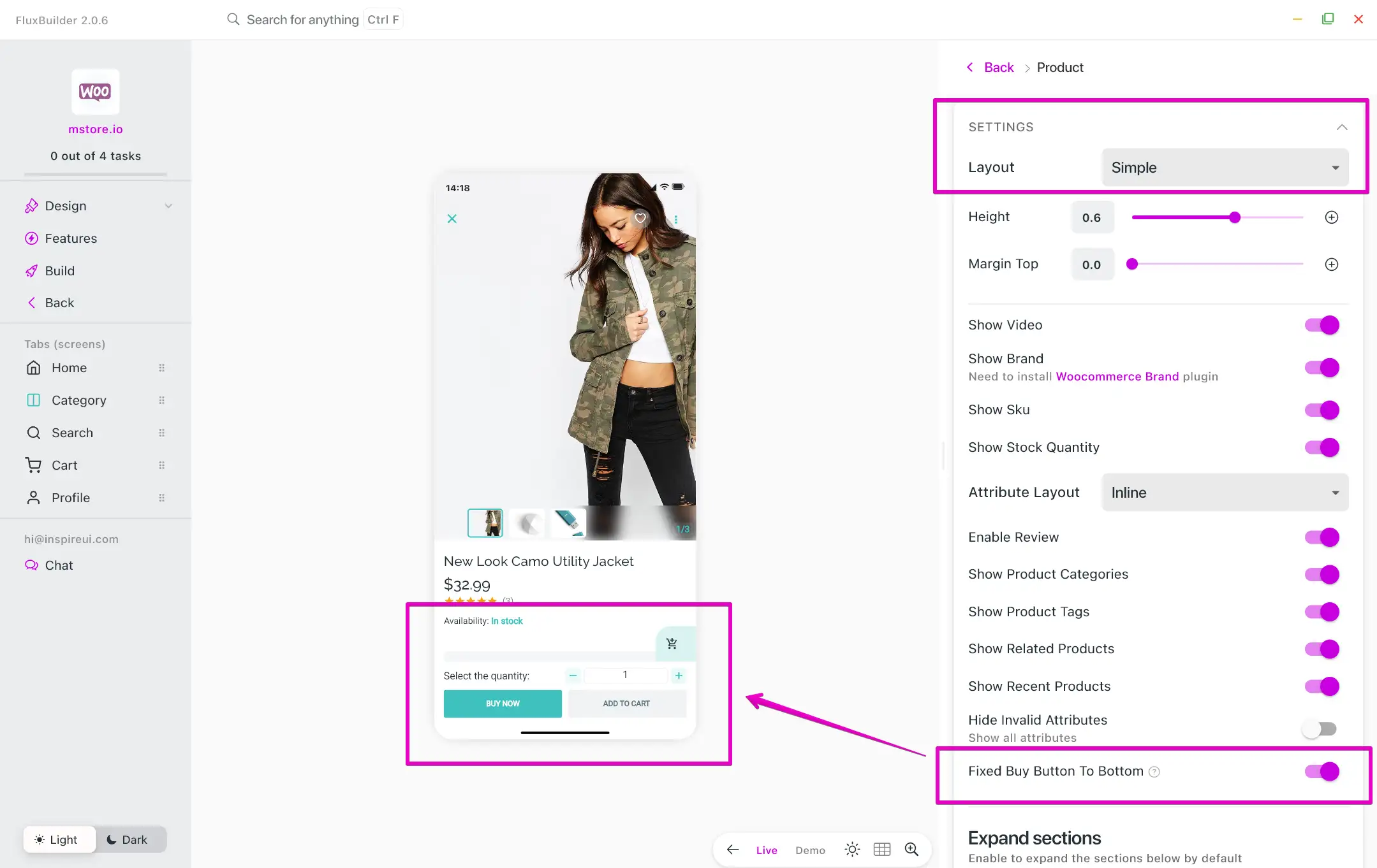
13. Buy Now Button to The Bottom by Default
For the Simple Type of Product Detail screen, the Buy Now and Add To Cart buttons can also be conveniently located at the bottom, ensuring easy accessibility.
Use FluxBuilder:
Step 1: Open your app.
Step 2: Select any product on the simulator.
Step 3: On the right side screen, select Simple layout and turn on Fixed Buy Button To Bottom.
14. Opening Time and Label in Listing
The Product Detail screen supports showing stores opening time and Open Now/Closed labels on app. The feature is available for Listeo and My Listing.
In order to enable the feature on the app, the Opening and Closing Hours of the listing need to be set up on the website. Please refer to the image below.
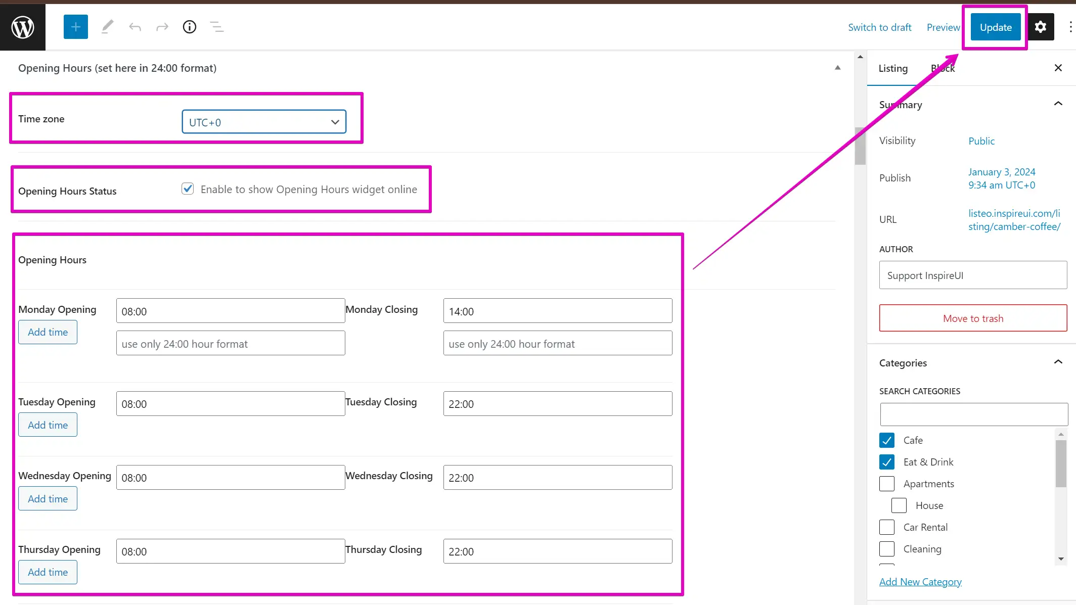
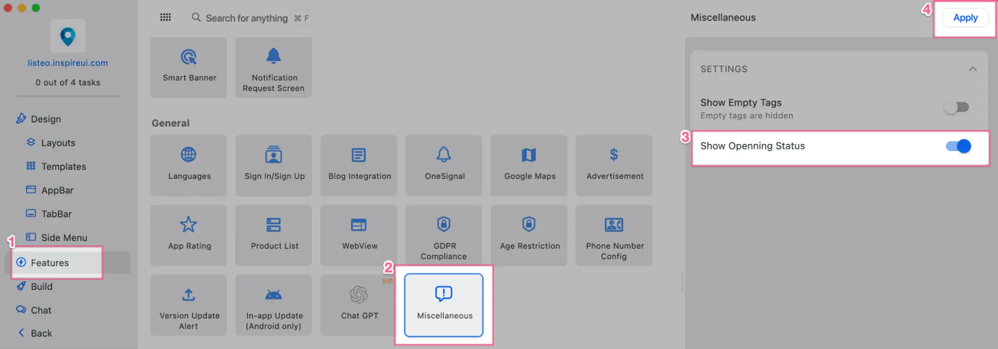
Then, open app on FluxBuilder, and:
Step 1. Enable Show Opening Status:
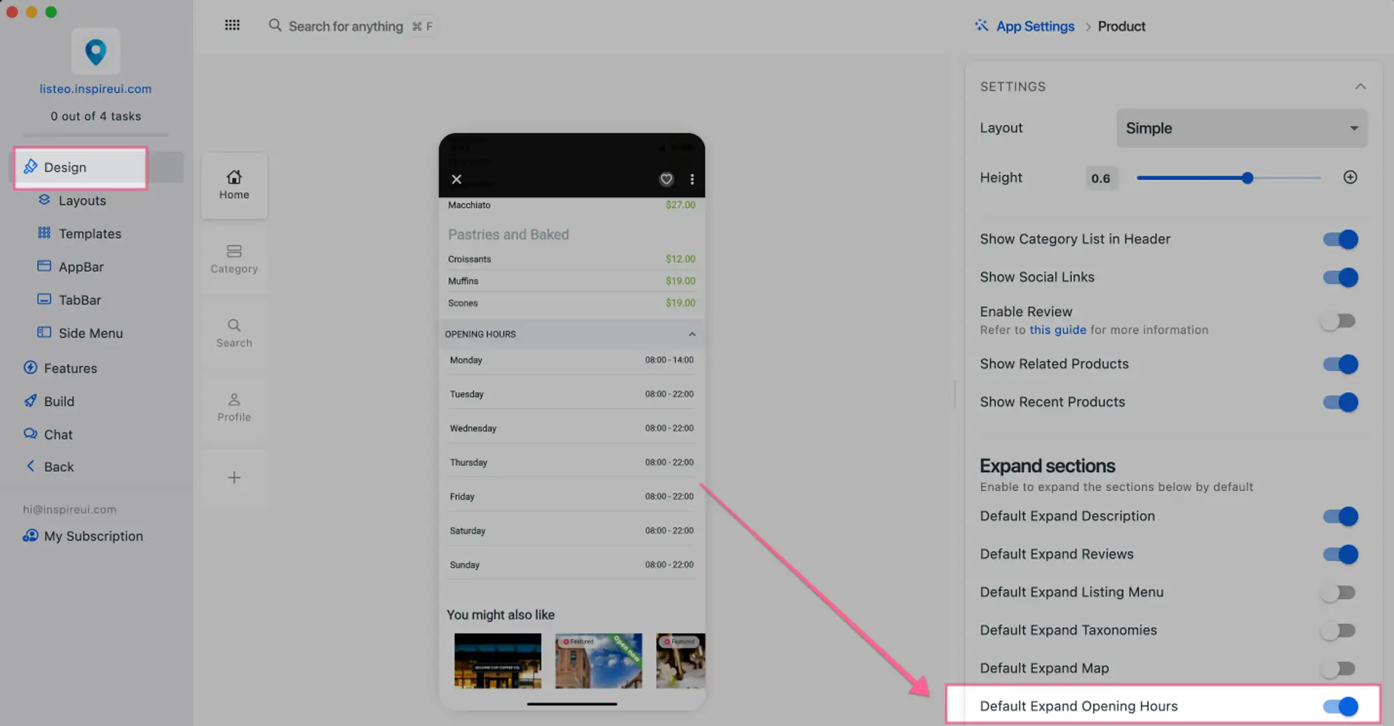
Step 2. Set expand opening status as default (so that users will immediately check the Opening Hours after opening Product Detail):
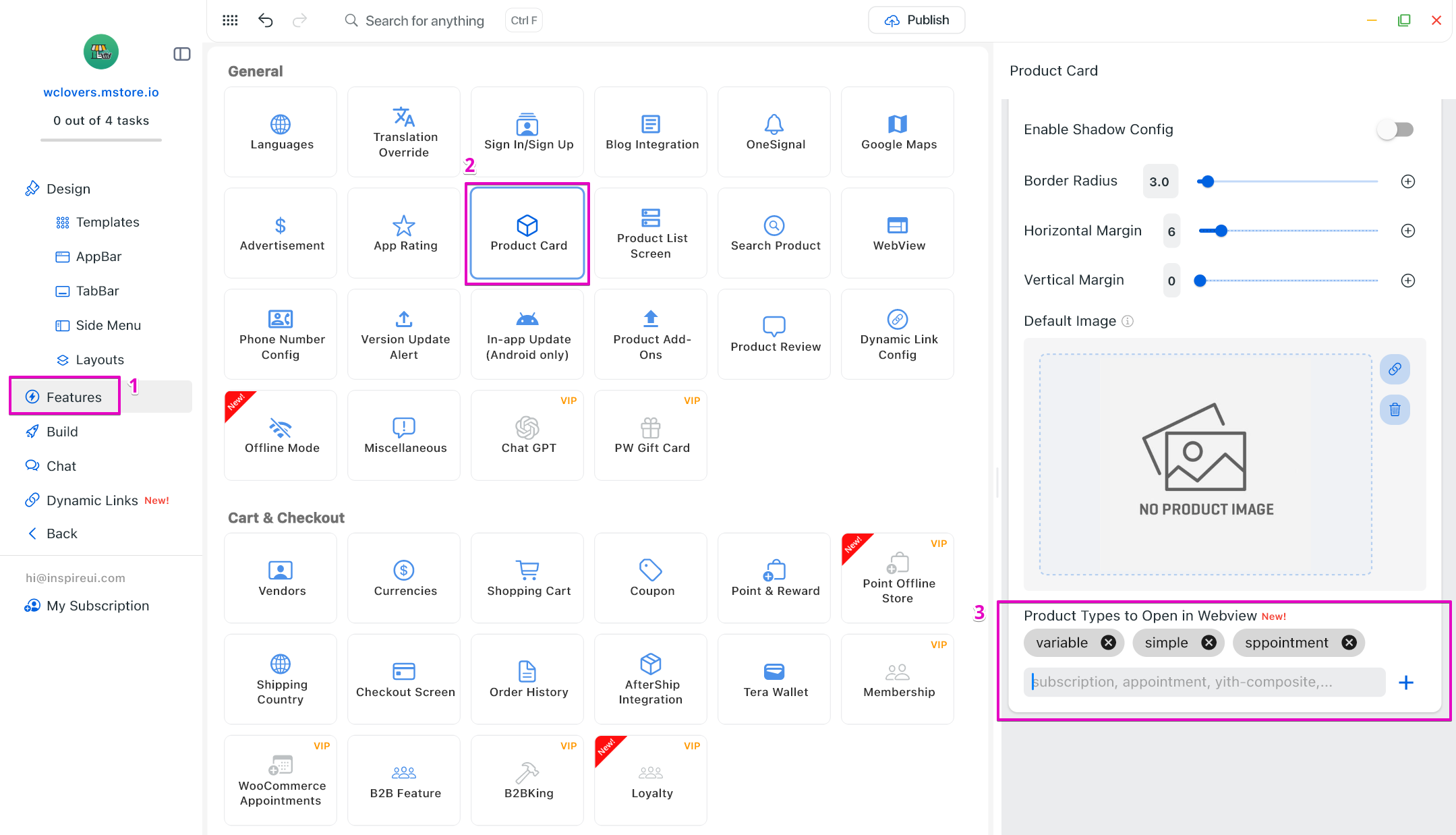
15. Open Product in Webview
“Product Type to Open in Webview”: Gain full control over navigation behavior by choosing whether products open in Webview or Native Product Detail based on product type, ensuring consistent user experience.
- Open your app on FluxBuilder.
- Go to Features. In General, open Product Card.
- In Product Types to Open in Webview, add the product types you want to open in webview.
- Click Save.
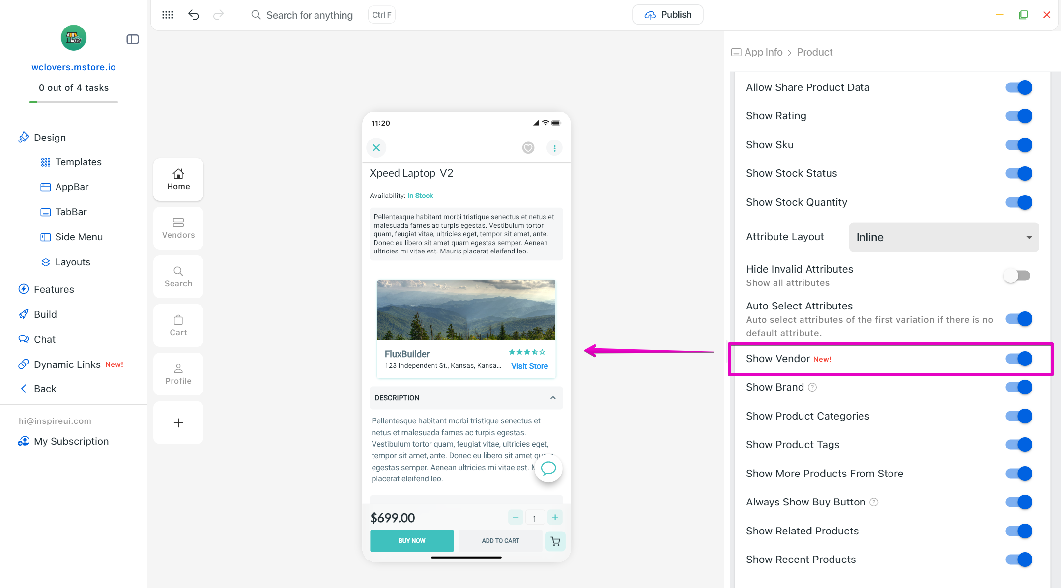
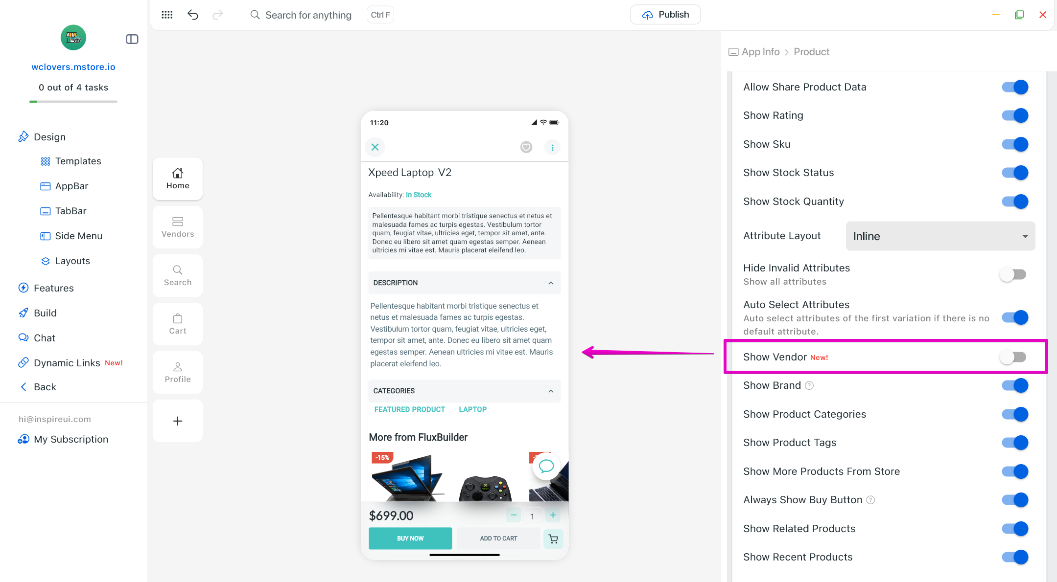
16. Show/Hide Vendor for Multi Vendors App
Vendor information is now displayed directly on the product detail screen, improving transparency and credibility for multi-vendor marketplaces.
Step 1: Open your Multi Vendors app on FluxBuilder.
Step 2: Select any product on the simulator.
Step 3: On the right side screen, enable/disable Show Vendor option.